Wednesday, February 28, 2018

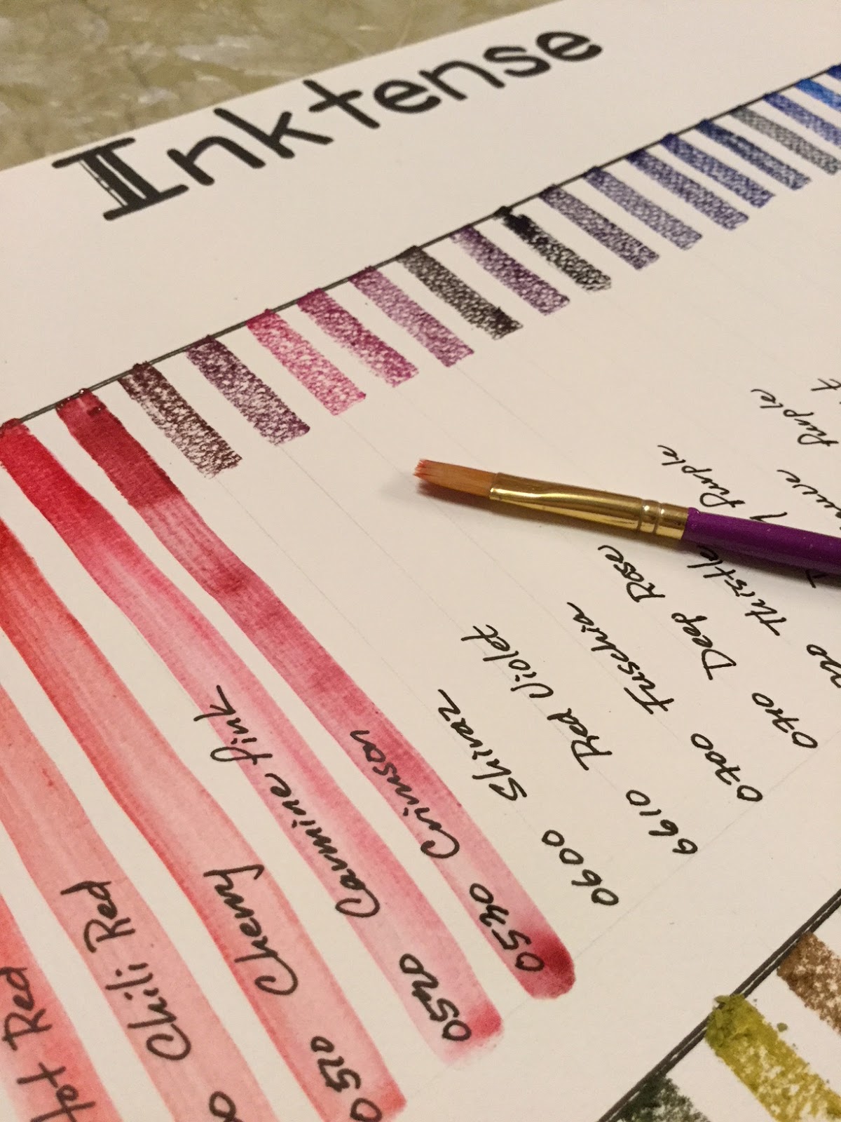
Derwent Inktense Color-swatch Chart

Derwent 72-color Inktense are gorgeous, rich, and intense. I also recently bought the Derwent Artbars, very different on many levels, but I will make some basic compare-and-contrast statements that aren't commonly written about.


Derwent Artbars (72 colors)
Derwent Inktense (72 colors)
Medium
Watercolor paints. Can be reactivated every time the painting is dampened, so layers are fragile and can be disturbed, but they allow more spontaneity as they can be changed if desired.
Ink—once activated with water and dried, doesn’t reactivate so takes layers very well! Once permanent, cannot be changed, so plan ahead.
Intensity
Pastel-like. Colors are grouped into four categories: brights, lights, earths, darks. I found the lights almost too pastel to be very useful. Marigold and carnation in the brights also extremely pale as were a couple in the earths (spice and Mediterranean especially).
For the most part these colors are powerful. A few like saddle brown, baked earth and willow and a couple of others were weak on intensity, but then I was only color-swatching and wetting with one steady swipe.
3-4cm crayon-like application and activation with water (one-swipe)
Activate quickly and the color is very smooth and evenly distributed.**** Applause, applause!
Activate quickly but consistently streak affecting even distribution of color.
Residue after one-swipe activation of crayon swatch
About 80% “melted” by the water
About 70% “melted” by the water
Color pulls down in 6-7 inch swatches
Color pulls down smoothly, easily, and except for lights, consistently
Color pulls down easily and  consistently but in streaks

Uses for me
On paper just like traditional watercolor paints, but they can be used to draw and then activated with water.
On paper light traditional paint, as a crayon and activated, and on cloth with textile medium—all permanent once dried.
Both of these mediums easily activate with a damp paintbrush on the bars themselves, eliminating the need for a palette or clean-up after painting—for me in my tiny apartment, this is phenomenal! Easy set-up and easy put-away!

awesome color, but note the streaking with the one-swipe water activation of the crayon-like application to paper
Derwent Inktense color-swatches
(compare with Derwent Artbars)
I was rather surprised that the Inktense set didn't come with a list of color names, but only had 4-digit numbers on each of the bars. Some of those numbers were very hard to see too. I actually had to go online to get a list of the color names to match the numbers, a bit of an inconvenience!

Then, thank goodness, I carefully checked each of the 4-digit numbers to the name on the list and found an error. There was no "Outline #2400" but I did have the Unknown blue color #1215. Very odd, with double meaning to that word as it was the only odd number in the 72-color set. All other bars were numbered roughly in 10-number increments. One of the reasons I checked the numbers before just labeling the bars is someone else online had complained of getting two bars of the same green color; she wrote the seller and was immediately sent the missing color. For me it's really no big deal, since at least all 72 of my colors are uniquely different.
After making sure of color of each bar, I labeled each so I can easily document which colors are used on future paintings.

And now all of my colors are clearly labeled and ready to use. Also note the little yellow tabs on the top pan. I put a cardboard piece under the fragile plastic form and attached the yellow tabs so I can easily pull the thin plastic palette out without damaging it. Now it feels quite durable and should last a good long time!

Wednesday, February 21, 2018

Painting Matryoshka x3

Getting a headstart on Christmas presents for 2018, and since my niece and nephews love playing with two matryoshka nesting doll sets I brought from Russia years ago, thought I would paint each of them their own set. (For interest, here's a history of the stylish matryoshka.)


Painting those little 5 1/2" dolls on the woodblocks was a lifesaver. The dolls were easy to hold, turn and I didn't get acrylic on me while painting or setting them down, and I didn't spray myself with the shellac either. Really nifty. They were glued down with glue sticks which was easily removable after painting.


WILD CATS for the oldest:


TRADITIONAL DOLLS for the niece:


SEA ANIMALS for the youngest:


So come Christmas the kids will have their own matryoshkas to play with!


Monday, January 29, 2018

Daniel Smith+ 31-color palette

So finally set up and painted out my professional watercolor palette. It's comprised of 31 Daniel Smith paints, several of which are the earthy primatek colors, 4 Winsor & Newtons, and 5 M Grahams. I'm trying to use up the M Grahams, lovely colors, but messy because of the gooey honey used in the formula. If I used my colors only in a studio, I would absolutely treasure my rich M Grahams, but the traveler has a messy paintbox because of the gooey paints, especially Pyrrol Scarlet, not a color anyone wants going all over their paintbox!


After I put together my colors and painted them out, my palette still had an empty lower left corner so added in the rich M Graham azo green (it's a bit less yellow than the W&N green gold already in the palette) and the three Turner paints: Alizarin Crimson (no one makes a color-fast AC so got a cheap color to test out what the rave on the color was about), copper (how absolutely lovely!) and clove (opaque but beautiful color no one else has). 


After painting 39 of the colors out (didn't include Buff Titanium as I can guess what the combinations would be), I realize I went a little heavier on earth tones than I intended, but in my defense my interest is animal painting and the colors I bought were mostly single pigment so capable of mixing with any other single pigment for "good" mixing qualities.

Thursday, January 25, 2018

Daniel Smith 240-color Chart

Daniel Smith has an extensive selection of watercolors, and while I can look online to see the color charts of others, sometimes it's hard to tell about intensity and mixing qualities of certain colors or even about how it looks in comparison with colors in other brands I'm more familiar with, so I ordered the DS 240-color-dot cards to paint out the sample of watercolors for myself.

If you turn the above chart 90-degrees to the left,
the 4 groups of colors are exact representations of the 4 DS 240-color dot-cards. 

The blues, greens and earth tones got my closest attention as I'm most interested in making animal paintings. One color that I was really looking forward to testing out was Yavapai, a yellow-brown ochre-like color; I wanted to see how it compared with raw sienna and goethite, but from this chart and looking at online samples I'm thinking that Monte Amiata might be a better color choice as Yavapai seems a bit browner than what I'm looking for. However, still not sure as Yavapai was NOT included in the 240-color selection. Bit disappointed, but I did learn a LOT and made shifts in what colors I would and would not get in the future. 

Sunday, January 21, 2018

Derwent Artbar Color Swatches + Sample Painting

Am pretty good about stemming impulse buys, but I bumped into a few questions on whether the Derwent Artbar were still being sold so tried to find out if they were being discontinued. Who can wade through the rumors on the web, so because I had been looking at the Artbars, and because Amazon had one left and at the cheapest price I'd ever seen, I did the impulse thing and bought the full 72-color-bar set. 

Here's the result of my impulse buy -- a full color chart of the Artbars. My method was to liberally apply 3 cm of color on dry 200gm watercolor paper and then add water with a paintbrush and drag the color down about 6-7 inches.  I might add I didn't apply strong pressure when liberally applying the color as the bars easily break along the score lines. The outcome is that the paint looked light but dried even lighter. Before purchasing, I did know the Artbars were a bit light in color but I was a bit surprised at just how pastel they are, especially the 12 colors in the "light" category.


That said, there are many ways to apply color. To make the chart above I used the dry then wet approach, but I found that wetting a paint brush and swiping up paint from the edge of an Artbar was a more effective way of painting; more effective on not leaving a trace of non-hydrated Artbar from coloring dry with pressure and more effective because the color intensity could be more easily managed. Like in the dry bar on dry paper method, for this wet brush on Artbar technique I didn't need a palette to mix the colors, but who would with a selection of 72 colors to choose from?! 

So here's a sample painting using the wet brush and swipe on Artbar method to get color for painting: 

Chinese-style tiger painting


Derwent Artbars and Pigma Micron pens - Original
My opinion about the Artbars? Well, they are pastel and because they are so light, I do wonder about how lightfast they are, and so am unlikely to use them for a painting to be hung on the wall. However, they are quite fun to use and I can see taking these "fun" colors out (and 72 of them!) when friends or kids come over and having an art party! A party without having color mixing trays so easy to organize and easy to clean up after too! They'll be awesome for making greeting cards or putting some quick and easy drawing-painting like the above in a letter. So this impulse buy isn't one that I regret.

Thursday, December 28, 2017

Color Theory - Those Tertiary Colors!

Claudia Nice, author of Painting with Color, Pen and Ink (2002), is an artist that resonates with my developing painting interests and style. Our artistic approaches: transparent watercolors with touches of ink! 

And when I saw her color wheel, I realized that our favorite color choices (the mixed colors) fell in the same color range as well. What I also realized from her color wheel below is that those favorite color mixes were equally spaced on the color palette and principally are tertiary colors. What an eye-opening moment for me! So I'm documenting this moment and in a year or two I'll look back and see how my color choices have changed and/or developed. The future of painting for me is ... still an open palette.

Color wheel taken from Painting with Color, Pen and Ink by Claudia Nice, p 11
color chart based on Grumbacher watercolors
Her colors of choice (grumbacher watercolors) are:
1. gamboge
2. thalo yellow green
3. yellow ochre
4. sap green
5. thalo green
6. burnt sienna
7. sepia
8. brown madder
9. burnt umber
10. payne's gray
11. thalo red (hard to replicate by mixing) 
Another note, Claudia never mentioned red iron oxide in her color choices, but this one, definitely a tertiary color as well, is an absolute must for my palette at the moment! Of course I would switch out several of the colors, but in principle, we have the same taste in color range, which reflects our choice in subject - for Claudia a range of landscape and wildlife, and for me more limited to wildlife in natural settings. 

I have to say, until now my choices of color and paint (M Graham watercolors) have been heavily influenced by Steve at Mind of Watercolor. The limited palette Steve introduced I very much love and several of them will probably always be in my limited palette as well: azo green, indian yellow (or new gamboge), and transparent red iron oxide. 

This chart evoked an interesting realization of the range in which my favorite colors fall -- the tertiaries, principally the earthy reds and greens!

Saturday, December 16, 2017

Comparing Louvre and Mungyo Oil Pastels

There's really not much online info about either the Louvre or Mungyo Oil Pastels, but I've gotten interested in the oil pastels since the month of "Inktober" when I had met an American who was greedily purchasing the open stock Sennelier brand at Hangaram, my favorite art store here in Seoul. We started talking and she was telling me about what she planned to do with the oils and was thinking that watercolor cold-press might be a good match to lay down the color on. Hmm, I'd seen lots of oil pastels before and even purchased many sets for kids, but I'd never taken them as a serious artist medium. After talking with her though, they started to intrigue me so a couple weeks later I decided to purchase a set. Certainly not Sennelier oil pastels since they are W2,800 per stick, but a set that seemed inexpensive mid-range -- the Louvre 48-color oil pastels for W23,000. 

As soon as I got home, I tried them out. Nope, not an alluring art form for me. No love. Just like coloring with crayolas. I knew they wouldn't be creamy-smooth like the Senneliers, but I didn't expect waxy crayon consistency (just slightly better really) and the need to apply firm pressure to get the colors to adhere to a sturdy rough sketchbook paper. My impression -- crayons at a glorified price. 

I went online and tried to read about them, but couldn't find much. The wrappers on the pastels give a French website but clearly state they are manufactured in China. With no info on the box, I should have been clued in that they wouldn't be super good. My bad. Anyway, while looking at oil pastels online, a couple artists who didn't want the expense of the Senneliers had commented on the creaminess of the Mungyos. I just filed that info away, but with no desire to test it out.

So today, I wanted to pick up a 24-color or even 36-color Mungyo Watercolor Crayons set as the 12-color set had been such a success with my neiceling and nephew a few days ago. And what do you know, right beside the set of 24 watercolor crayons (W7,200 or about $7) was a 24-color set of Mungyo Aquarelle Oil Pastels for W6,300. For that price, why not? I could try something out, and then if I didn't like them, my neiceling and nephew and I could spend a winter afternoon just having fun with them and they would be well worth the money.

I have to say though, the Mungyos are a pleasure to use. Really fun in fact. The are quite creamy (not like the Senneliers but still nice) and just touching them to the paper leaves an oily trail of color. Like the Louvres, they do leave crayon-line waxy flakes, but those waxy flakes can be easily pushed into the paper or wiped in a color-trail across the paper with the finger. The Louvres don't manipulate much. That said, it means the Mungyos smear more easily, which I realized after my little cactus drawing was nearly done. In the future, I'll just use a piece of wax paper to buffer my hand and protect my drawing. 

Here's a comparison using the greens and yellows of the Louvre 48-color set and the Mungyo 24-color set. Despite using more Louvre colors, Mungyo achieved the same richness with fewer. They were easier to lay down and blend (the yellow petals). In my opinion, the only way the Louvre had the edge on Mungyo is the pastels would be much easier for doing finer drawing as they are much harder and can hold an edge necessary for more detailed work.

Comparing Louvre Oil Pastels on the left & Mungyo Aquarelle Oil Pastels on the right
(left) Louvre oil pastels used - 1 dark blue, 5 greens, 4 yellows, 1 orange
(right) Mungyo aquarelle oil pastels used - 1 dark blue, 3 greens, 2 yellows, 1 orange
The Mungyos were much easier to lay down color,  and I did intentionally smudge the yellow petals a bit on the Mungyos, a technique that didn't work so well with the Louvre pastels.
After comparing their colors, thought I'd test out the aquarelle aspect of the Mungyos. Just lightly flicked the base of the cactus barrels with a firm damp brush and the colors, even on the first stroke, flicked up the barrels. I flicked a brush 3-4 times on the largest barrel (at the base) and realized the brush was picking up the color and the contrast was disappearing. Must remember this! The Mungyos both smear easily across the paper (I think a positive point) and respond quickly to even the lightest touches of water.

For me, this means I have found an art medium for laying down quick medium and making quick adjustments to spread that color with minimal effort. Yep. Definitely like the Mungyos!
Made this the day I bought the Louvre oil pastels. Laid down the oil color quite thickly but the sketchbook paper could still be seen through. (Same paper as the cacti above.) Then, as I saw online, dipped a wide firm brush in coconut oil and used the oil as a medium for adjusting the colors. Discovered the colors responded quite differently. The red, orange and pink blended adequately with the coconut oil, and I really worked at blending the blue of the "M" (meh, am not a keener), but the light purple pretty much refused to blend -- very waxy and crayon-like. Then, to test how much color I was picking up and moving, started swiping the page with the "loaded" brush. It's obvious the brush wasn't loaded and the colors didn't shift much ... They are just glorified crayons after all.