Showing posts with label painter's palette. Show all posts

Thursday, January 24, 2019

Pigment Testing 52 Daniel Smith Paints

Daniel Smith makes some delicious colors, and I irresistibly have bought more than I need. I'm finding that a few of them are rather similar ... and yet different ... so thought I would test them out to see which pigments had the best texture, which could be textured through salt or other devices (and which ones didn't respond much to texturing attempts), which traveled the fastest in water and which ones tended to stay put, and of course which ones Daniel Smith announced as highly transparent and then whether I agreed or not based on outcome. 

I'm not writing down all the outcomes I noted. Wow, would that take time since there are indeed 52 here! But the charts below can be tapped on and enlarged and the various outcomes do become quite apparent. One regret I have in making this chart is, I was particularly interested in texturing with cotton netting gauze; however, I pigmented that area too much so the gauze hashtag effect is rather obscured. Ah well. I'll know better when it comes time for practical application!


The Legend ... for comprehending the transparency and texturing tests for this chart:


52 Daniel Smith colors pigment tested for transparency and texturing

DS pigment test outcomes remarkably lovely here!

The DS reds and pinks were weaker on texturing effects than the blues, greens and earth tones.

Wednesday, February 28, 2018

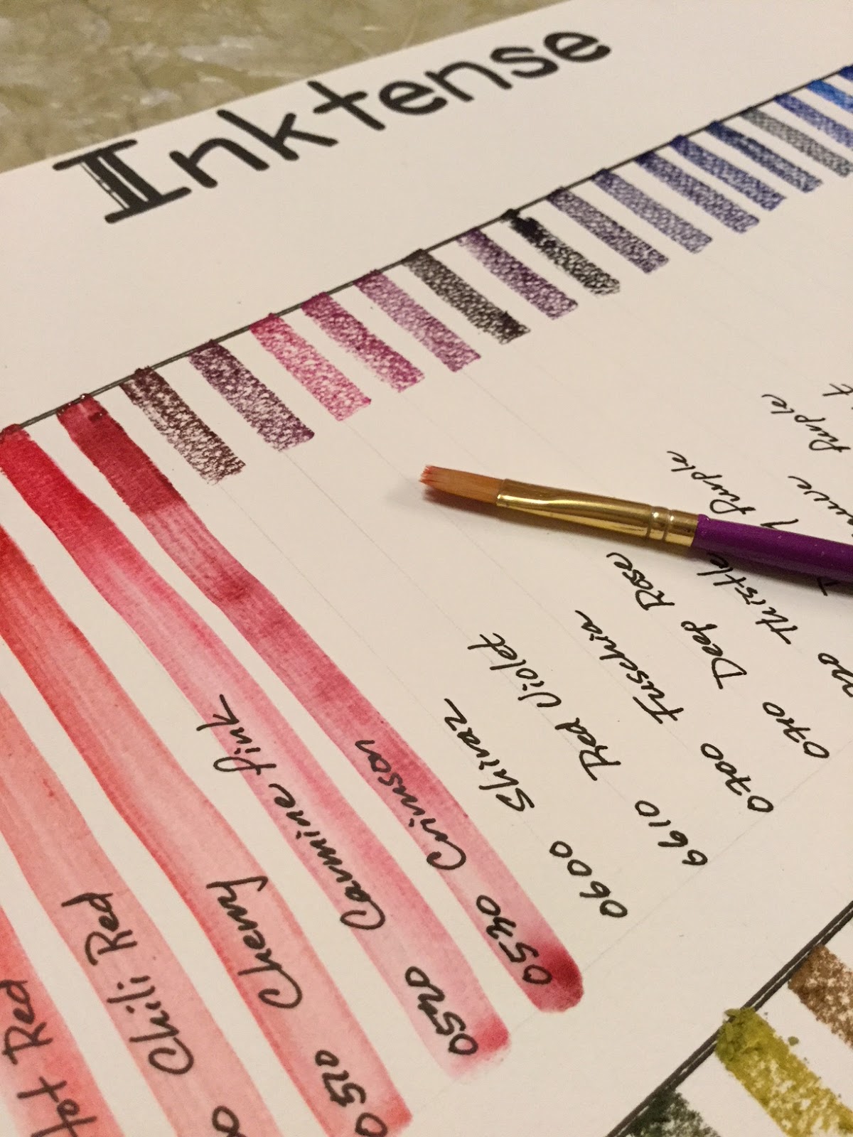
Derwent Inktense Color-swatch Chart

Derwent 72-color Inktense are gorgeous, rich, and intense. I also recently bought the Derwent Artbars, very different on many levels, but I will make some basic compare-and-contrast statements that aren't commonly written about.


Derwent Artbars (72 colors)
Derwent Inktense (72 colors)
Medium
Watercolor paints. Can be reactivated every time the painting is dampened, so layers are fragile and can be disturbed, but they allow more spontaneity as they can be changed if desired.
Ink—once activated with water and dried, doesn’t reactivate so takes layers very well! Once permanent, cannot be changed, so plan ahead.
Intensity
Pastel-like. Colors are grouped into four categories: brights, lights, earths, darks. I found the lights almost too pastel to be very useful. Marigold and carnation in the brights also extremely pale as were a couple in the earths (spice and Mediterranean especially).
For the most part these colors are powerful. A few like saddle brown, baked earth and willow and a couple of others were weak on intensity, but then I was only color-swatching and wetting with one steady swipe.
3-4cm crayon-like application and activation with water (one-swipe)
Activate quickly and the color is very smooth and evenly distributed.**** Applause, applause!
Activate quickly but consistently streak affecting even distribution of color.
Residue after one-swipe activation of crayon swatch
About 80% “melted” by the water
About 70% “melted” by the water
Color pulls down in 6-7 inch swatches
Color pulls down smoothly, easily, and except for lights, consistently
Color pulls down easily and  consistently but in streaks

Uses for me
On paper just like traditional watercolor paints, but they can be used to draw and then activated with water.
On paper light traditional paint, as a crayon and activated, and on cloth with textile medium—all permanent once dried.
Both of these mediums easily activate with a damp paintbrush on the bars themselves, eliminating the need for a palette or clean-up after painting—for me in my tiny apartment, this is phenomenal! Easy set-up and easy put-away!

awesome color, but note the streaking with the one-swipe water activation of the crayon-like application to paper
Derwent Inktense color-swatches
(compare with Derwent Artbars)
I was rather surprised that the Inktense set didn't come with a list of color names, but only had 4-digit numbers on each of the bars. Some of those numbers were very hard to see too. I actually had to go online to get a list of the color names to match the numbers, a bit of an inconvenience!

Then, thank goodness, I carefully checked each of the 4-digit numbers to the name on the list and found an error. There was no "Outline #2400" but I did have the Unknown blue color #1215. Very odd, with double meaning to that word as it was the only odd number in the 72-color set. All other bars were numbered roughly in 10-number increments. One of the reasons I checked the numbers before just labeling the bars is someone else online had complained of getting two bars of the same green color; she wrote the seller and was immediately sent the missing color. For me it's really no big deal, since at least all 72 of my colors are uniquely different.
After making sure of color of each bar, I labeled each so I can easily document which colors are used on future paintings.

And now all of my colors are clearly labeled and ready to use. Also note the little yellow tabs on the top pan. I put a cardboard piece under the fragile plastic form and attached the yellow tabs so I can easily pull the thin plastic palette out without damaging it. Now it feels quite durable and should last a good long time!

Monday, January 29, 2018

Daniel Smith+ 31-color palette

So finally set up and painted out my professional watercolor palette. It's comprised of 31 Daniel Smith paints, several of which are the earthy primatek colors, 4 Winsor & Newtons, and 5 M Grahams. I'm trying to use up the M Grahams, lovely colors, but messy because of the gooey honey used in the formula. If I used my colors only in a studio, I would absolutely treasure my rich M Grahams, but the traveler has a messy paintbox because of the gooey paints, especially Pyrrol Scarlet, not a color anyone wants going all over their paintbox!


After I put together my colors and painted them out, my palette still had an empty lower left corner so added in the rich M Graham azo green (it's a bit less yellow than the W&N green gold already in the palette) and the three Turner paints: Alizarin Crimson (no one makes a color-fast AC so got a cheap color to test out what the rave on the color was about), copper (how absolutely lovely!) and clove (opaque but beautiful color no one else has). 


After painting 39 of the colors out (didn't include Buff Titanium as I can guess what the combinations would be), I realize I went a little heavier on earth tones than I intended, but in my defense my interest is animal painting and the colors I bought were mostly single pigment so capable of mixing with any other single pigment for "good" mixing qualities.

Friday, December 15, 2017

Watercolor Turtle

For my New Year's gift to myself am ordering a bunch of Daniel Smith watercolors. Last winter I ordered my first professional grade watercolors, 11 tubes of M Graham. And I absolutely love how juicy and rich the M Graham colors are, and how transparent they are! But their one downside, and it's a big one, is that their formula has honey (thus their juicy-ness) and so they make quite the mess in my little Altoid tin. 

Yeah, I could just order a small set of another brand for plein aire, but I'm traveling so much, in hot weather in the summer time and dropping my backpack on the heated Korean floors in the winter time, making those paints flow like honey, so I'd prefer to just order a large set of "firmer" paints so that not only my Altoid tin could be grabbed but any sized palette I have could be dropped in my backpack on a moments notice. After reading about pigments and checking on transparency, decided on Daniel Smith. I'll also get a few Winsor and Newton too because I prefer some of their pigments or coloration.

Anyway, pulled out my M. Grahams tonight and realized that 10 of the 11 colors would fill a small 10-dish ceramic palette, so set it up and had some fun!

First background attempt for the background, using water and colors on seran wrap, didn't work out for me. Great idea though and will attempt it again in the future.
M Graham: hansa yellow, azo orange, scarlet pyrrol, transparent red iron oxide, sepia, Payne's gray, phthalo blue, ultramarine blue, phthalo green, azo green
laying down background colors (phthalo blue and ultramarine blue) on a semi-wet paper 
Misted the damp background with 91% alcohol and got an instantly mottled look.
Laid down some colors on the turtle -- azo green transparent red iron oxide and then touches of sepia
simple watercolor turtle on New Soho series SKETCH paper - 5" x 7"

Sunday, November 5, 2017

Plein Air Painting at Sochi House

Today is the fifth day in the OAS (Oriental Art Supply) November painting challenge. Since I was traveling this weekend (did templestay at Ssanggye-sa Temple, Jindo Island, Jeollanamdo, South Korea, and because the temple is right beside Sochi House, the traditional home of the famous aristocratic painter, Sochi, penname for Ryun Hur (1808-1893), I did a bit of plein air painting at the traditional house. Actually I started but had to finish at home because before I could finish our templestay group had to hike up the trail to the temple where we were staying.) 

Sochi House
Jindo Island, Jeollanamdo, S Korea. 

Sochi, pen name for Ryun Hur (1808-1893), was a traditional painter and calligrapher with many disciples. Despite his father's wishes, he became a painter (an unstable job that didn't bring in steady income), but though he wasn't loaded with money, he was satisfied with his choice to exercise his creativity. He was a passionate artist, and he became the founding father of 5 generations of artists, with the fifth alive today. He and his artists descendants strongly influenced Korean painting; they seemed to have contributed to a more realistic approach to painting nature. Their pictures show development in depth and tone. Shading and brush stroke were changed to add to the more realistic style. 

Kaleidoscopic Altoid plein air palette --- M Graham paints are too messy for plein air! So are Sennelier too I hear.
Sochi House, home of Korean traditional painter, Ryun Hur (1808-1893)
The pond just in front of Sochi House, Jindo, South Korea

Micron pens and Altoid box plein air painting with M Graham on Fabriano watercolor postcard. (FYI, M Graham and Sennelier are honey consistency paints that are perfectly lousy for plein air painting .... but absolutely smooth and creamy for studio on site painting! My Altoid box is now a kaleidoscopic mess!)

Sunday, October 15, 2017

24-watercolor Mixing Chart: Shinhan SWC and M. Graham

So I've spent a few hours "learning" my first professional watercolor palette set. The set is a combination of M. Graham and SWC -- the SWC ShinHan Watercolor Professional, not to be confused with tubes that read just ShinHan Watercolor Professional. Yes, confusing! Pictures below to exemplify the difference. 

ShinHan, a popular Korean brand of watercolor (and other art materials). I realize that both SWC and PWC are now marketed by ShinHan with PWC short for Profession Water Color, but I've never seen PWC in any of the big art stores here in Korea but SWC is now widely sold. The ShinHan Watercolors Professional (ex. Bordeaux and Red Violet above) have been sold for years, and only in the past year or two (as I'm aware) the SWC has hit the market as the professional grade. Shami, another ShinHan watercolor, is the kiddie-student grade.

my first professional watercolor palette
Combination of 11 M. Graham, 11 SWC ShinHan Watercolor Professionals, and 2 ShinHan Watercolor Professionals


Hansa Yellow (MG), Azo Yellow (MG), Indian Yellow (SWC), Raw Sienna (SWC), Azo Orange (MG), Scarlet Pyrrol (MG), Pyrrole Red (SWC), Quinacridone Red (SWC), Crimson Lake (SWC), Bordeaux (ShinHan), Red Violet (ShinHan), Cobalt Light Violet (SWC), Ultramarine Blue (MG), Cerulean Blue Hue (SWC), Peacock Blue (SWC), Phthalo Blue (MG). Phthalo Green (MG), Terre Verte Yellow Shade (SWC), Azo Green (MG), Transparent Red Iron Oxide (SWC), Burnt Umber (SWC), Umber (SWC), Sepia (MG), Payne's Gray (MG)
M. Graham (x11), SWC ShinHan Watercolor Professional (x11), and ShinHan Watercolor Profession (x2) 

Analysis of the Chart and My Color Choices

Wow, did I learn a lot about color combinations from making this chart: which colors are likely to muddy when combined, which ones become opaque, which are heavily or lightly pigmented, or redundant colors, and which ones become beautiful rich blacks. I'm already figuring out what my ultimate preferred color palette will be...

The 2 ShinHan colors aren't heavily pigmented but wow do they lay color on the paper well and have rich smooth texture. It'll be hard replacing them because they're so enjoyable to use. The downside for them is I end up using a lot of paint and made significant holes in the palette cubes. In the long-run it'll be cheaper to use a more pigmented paint. I chose those colors, however, because they are transparent (my whole palette is except the semi-transparent Payne's Gray and Sepia) and because I liked how they completed my range of palette colors.

Just an aside, ShinHan watercolors, though student grade watercolor, are quite brilliant and very smooth and rich. Alpha, another old watercolor brand here Korea and also student grade, is quite inferior (my opinion) -- colors don't lay down smoothly, not as rich, perhaps chalky. I don't enjoy painting with them at all. Mission is a new Korean watercolor brand that has recently come onto the market. I haven't used them, but they are said online to be quite beautiful. I'd buy a set of them, but for two reasons: many fugitive colors, and Mission sets are heavy into reds but weak in the blues and greens. I'm interested in painting animals, not floral arrangements so they don't suit me.

I really like all of the SWC paints that I chose, except one -- Cobalt Light Violet. While it's a very beautiful color, it isn't heavily pigmented at all and doesn't lay down smoothly on the paper. Kind of streaky, in fact. Other colors easily over-power it, which is not a problem really, it's just streaky. There is only one other weakly pigmented color, also a SWC color: Terre Verte (Yellow Shade), and I won't be replacing it because I absolutely love it! Gorgeous soft color that when combined with some other colors becomes opaque. Interesting effect rather than annoying. I really dug my brush into this color and had to refill the paint cube while with other cubes I was barely skimming the top, but I'll definitely be keeping this color in my palette! Combines beautifully with almost every color in my palette too!

The M. Graham paints are glorious, and most richly pigmented, even more than the SWC paints. The only bone I have about M. Graham is that they are rather runny. I've noticed that in the past couple of days when the weather has gotten much cooler -- in the 60s and low 70s -- the paints have finally made a film on the surface. Finally, after many many days of leaving my palette open! I don't think I'll keep buying M. Graham because I use my paints also in an Altoid tin for on-the-go. My goodness is that tin a mess! Not much fun painting when colors are swimming into each other.


Changes to My Future (Perfect) Palette

Not sure about the "perfect" palette yet, but I think the future paints I buy, if I can't find the transparent colors I want with SWC watercolors, are Daniel Smith. D.S. has a huge range of colors (too many to choose from ... having trouble!) and they aren't messy for plein air painting. They aren't available here in Korea to my knowledge, which is fine as name brand art stuff has a stiff mark-up in Korea. I'll order them off either Dick Blick or Jerry's Artarama for discounted price, and have them sent to an American address for free shipping and handling. That way, nice paints then become affordable paints.

Necessary changes:

  • Bordeaux (ShinHan) - redundant color with SWC Crimson Lake (remove)
  • Red Violet (ShinHan) - lovely but not highly pigmented; replace with Quin Magenta (D.S.)
  • Cerulean Blue Hue (SWC) & Peacock Blue (SWC) - both PB 15:3 as is Phthalo Blue (M.G.) and nearly identical when mixed; remove both and replace with Manganese Blue Hue (D.S.) 
  • Burnt Umber (SWC) and Red Iron Oxide (M.G.) - too similar; replace Burnt Umber with Bronzite Genuine (D.S.)

Other changes:

  • Hansa Yellow (M.G.) and Azo Yellow (SWC) are quite similar; replace Hansa Yellow with Lemon Yellow (D.S.)
  • Quinacridone Gold (D.S.) is so amazingly beautiful; replace Indian Yellow (SWC) with Quin Gold
  • Goethe (Brown Ocher) Genuine (D.S.) is granulating and Raw Sienna (SWC) is not; replace Raw Sienna with Goethe Genuine (semi-transparent) or Yavapai (natural iron oxide) Genuine (transparent and a bit lighter, more like a sand color)
  • Mayan Blue Genuine (D.S.) add; it's incredibly rich and 4 blues in a 24-color palette seems appropriate
  • Cobalt Light Violet (SWC) just doesn't lay down smoothly; replace with perhaps Wisteria (D.S., semi-transparent though and non-granulating) or Ultramarine Red (D.S., transparent but granulating) 

Tuesday, October 3, 2017

My First Professional Palette

I've played around for the last 6 months or so with student quality or dollar store paints, and after seeing the more professional people successfully lay down beautiful colors that flow and gently blend into each other, I've taken the time to put a palette together. The first picture I did a few days ago with the pro paints was satisfying -- those colors just happily mixed and there was less "bloom" with the pro colors!

So originally I bought a $14 set of cheapie AQUAnaut paints off Amazon. Thought I would pop the colors out and use them like chalk for something ... but then decided that it was too much effort. I really liked the paintbox -- it efficiently holds and organizes 24 colors on one side of a box, it's metal so won't stain, and best of all, it's compact with no detachable parts and can be clipped to a palette board for a simplistic plein air style of painting! Went to Hangaram, one of the biggest local art stores here in Seoul, and found the very same paintbox. Yep, bought it.

And since I was setting up my professional "large" paintbox, I also put together yet another Altoid box of paints, this one professional. Paints used were an eclectic mix of M. Graham and SWC (ShinHan Water Color Professional).

The $14 AQUAnaut set on the left (I decorated the back of the color swatches) and the M. Graham and SWC medley of transparent watercolors on the right. I have to say, Steve at The Mind of Watercolor has really influenced my choice of paints. He uses M. Graham, which isn't a controlling factor for me, but he also chooses to paint with principally transparent watercolors because they're excellent for glazing. Now this last point is something that resonates with me!

And since I live in S. Korea and SK has recently come out with a professional brand of watercolors, which are principally transparent, easily accessible to me, gorgeous in color, and very reasonably priced, I selected 13 colors from SWC, and then after considering transparency, colors and price, chose M. Graham as the other brand to complete my palette of only transparent colors. They compliment each other beautifully! I'm so ready to paint!
Left - $14 AQUAnaut set for experimenting with; Middle - my new Altoid box of professional paints; Right - my M. Graham and SWC professional paint box. 
Colors all labeled to name brand, color, pigment, transparency (only two are semi-transparent: M.G. sepia and M.G. Payne's grey), lightfastness (I only bought the two highest lightfast ratings for both brands), and whether they are staining or granulating.
After setting up my paintbox, I put a little watercolor art on the back of the paint box color swatch sheet.
Professional paints in a box for on-the-go painting.
My all-new professional paintbox: studio and plein air sizes.

Monday, May 8, 2017

Arranging a Marie's Chinese Watercolor Palette

After using the excuse that I don't paint as much as I'd like because I need to put together a wet palette before actually painting a picture (working with wet paint is the way to go), thought I would just bite the bullet and make a "dry" palette, so in the future, seeing a whole arrangement of colors already laid out would inspire me to just grab a paintbrush, a cup of water and sit down. 

I've read the debate between choosing "good" watercolors with rich pigments versus student-grade watercolors with fillers replacing pigments and think there's a lot to be said about starting with the more professional grade. Shinhan Professional Watercolors and Mission Gold Pure Pigment both are quite highly regarded as professional grade while still being reasonably priced -- wonderful! That said, I'd like to paint sometimes on Chinese scrolls which have hanji (Korean traditional handmade mulberry paper) or Chinese/Japanese rice paper, but traditional watercolors aren't designed to be painted on the thinner paper. They bleed horribly. 

According to what I've read ... and seen with Chinese watercolorist Lian Quan Zhen, Marie's Chinese watercolors have a special binder that suits them well for painting on the thinner paper. The names of colors are only written in Chinese but they do have numbers -- not sure what the numbers mean but they can at least conveniently be used for refilling the palette -- so with a 24-watercolor set, arranged and filled my first non-travel palette. 

Paints for rice and other traditional handmade papers

Before filling the 28-well palette, I washed off the residual manufacturing toxins, dried the palette and then buffed the 5 mixing wells with a scrap of sandpaper. Have seen paints don't spread well on glossy plastic so other artists have learned the trick of dealing with the problem -- rough up the plastic a bit.

Of course I arranged the colors in the palette according to my taste. Didn't use the black and at the last minute decided to go ahead and use the white ... might use it to tint a color, who knows. Didn't use one of the greens (#592 and #593 are just too similar, and wish I didn't use one of the blues as #492 and #493 are too similar as well), so that left me with 6 extra wells. Filled those with colors from ShinHan Professional, a Korean brand of watercolors; they are not Chinese watercolors with extra binder so not sure how they'll work, but thought because they extended the color range (5 of them very earthy colors), I would at least add them to the palette and use them on rice paper with caution. [A comment on Marie's 24-set: rather weak on yellows with only #218 and #242. A bit of a surprise as yellow is one of the primary colors, but the many oranges, reds, blues and greens do reflect the more stylized landscape and botanical painting style of Chinese painting.]

Be aware that Amazon markets two different boxes of Marie's watercolors x24 sets. One set has the more traditional range of Western colors (colors are also written in English), and then there are the Chinese watercolors without English and whole different range of pigments, and evidently, binders as well.

Marie's Chinese Watercolors, 24-paint set
Filled the 28 wells with 22 Chinese watercolor paints and 6 Shinhan Professional Watercolor paints
A quick study of a swan
Painted the swan using only two colors only (#495 a Prussian blue and #406 a Bordeaux) and a Micron 001 pen.
Mixed Media drawing-dessin-pastel watercolor 200 g/m paper, 5 3/4" x 8"

Made the classic mistake of beginners ... not maintaining white space to show contrast. Aw well.

Friday, March 17, 2017

Altoid Paint-box #2

I really like my first attempt at making an Altoid box painter's tin. With 15 colors it has enough color variety so that I don't have to constantly double-dip the brush tip in multiple colors to get the variety I need. Double-, triple-dipping muddies the tip, especially because the tip isn't cleansed in water frequently. The one downside of this set however is because I used really cheap paint (why not? needed to learn and not waste more expensive paints till I get technique). I found the colors didn't blend well but stayed separate. It's not really important because I'm using a small waterbrush instead of the broad sweeps of a typical paintbrush which require more color blending, but still, I do notice a difference between my inexpensive Korean set of Alpha paints and the dollar-store cheapies I used in the tin. Since a friend gave me a new set of 18 watercolors (Reeves, also cheap but figured they'd be better than the cheapies in the tin), thought I'd make another tin.

Pictured: original Altoid tin with dollar-store cheapie paints (adequate but colors stay separate when attempting to blend)

4"x6" mixed media paper for marker, pen and ink, and watercolor
"Bluebirds & Flowers"

Prepping the Reeve Watercolors

Before I squirted colors from the tubes into the new 21-hole palette made from Fimo, I first made a color grid (saw this online somewhere) to check out the transparency and opacity of the new (Reeves) watercolors.


Made a five-columned grid, basically each color name followed by a long swatch of color. However, before (and then after) the color was painted, a vertical stripe of first oil-based marker and water-based marker were painted down the sheet. The idea is to test and see how transparent or opaque each of the colors are both before and after the colors are used. Watercolors are thought all to be transparent but this is not so, and colors differ (sometimes significantly) by brand name. 

Then in the wider last column, a wet brush was used to scrub a bit at the painted colors to see if the colors could be lifted off or if (and how much) they stained. These Reeves colors do not lift off but do stain quite noticeably. I noticed two other downsides: like the dollar-store cheapies, the Reeves don't blend well, and, when dry, their color is noticeably granular, especially in large swatches. Sadly, after all this work of testing, I've decided not to use the Reeves in my new 21-reservoir Altoid tin. From a very old set of Korean Alpha, I made my new Altoid paint tin. Though quite cheap, the Alphas flow better, blend fairly nicely, and most can be somewhat lifted off the paper. A few colors from the Reeves (like flesh tone, crimson, burnt umber and payne's gray -- all somewhat opaque colors) will supplement the 18-color Alphas to fill in the 21-hole paint reservoirs. I'm omitting the white as many watercolorists carry a tube of white gouache for painting quick contrasting highlights.


"testing" transparency and opacity of Reeves watercolors

Making the Altoid Paint-tin

This time I made two tins at the same time, the second one is for the professional-grade paint ... when I finally make the investment.

To make the uniformly spaced holes, mom gave me the tip of using a hole-punched grid. And then looking around the kitchen she suggested using the base-end of the walnut-cracker for systematically imprinting holes in the Fimo clay. Wow! Both ideas worked fabulously! Then after shaping and baking the Fimo, I sprayed one with white rust-proof outdoor paint we had on hand. I'll wait to spray the other with white ceramic paint since that's the recommended paint and I'm not needing the second tin for a while.


Finished Altoid Tin

My 21-reservoir Altoid tin, and a second one almost ready too. They look good against my handmade hanji-art pen box.