Showing posts with label hanji. Show all posts

Monday, May 13, 2019

Tapsa at Maisan in Chinese Ink

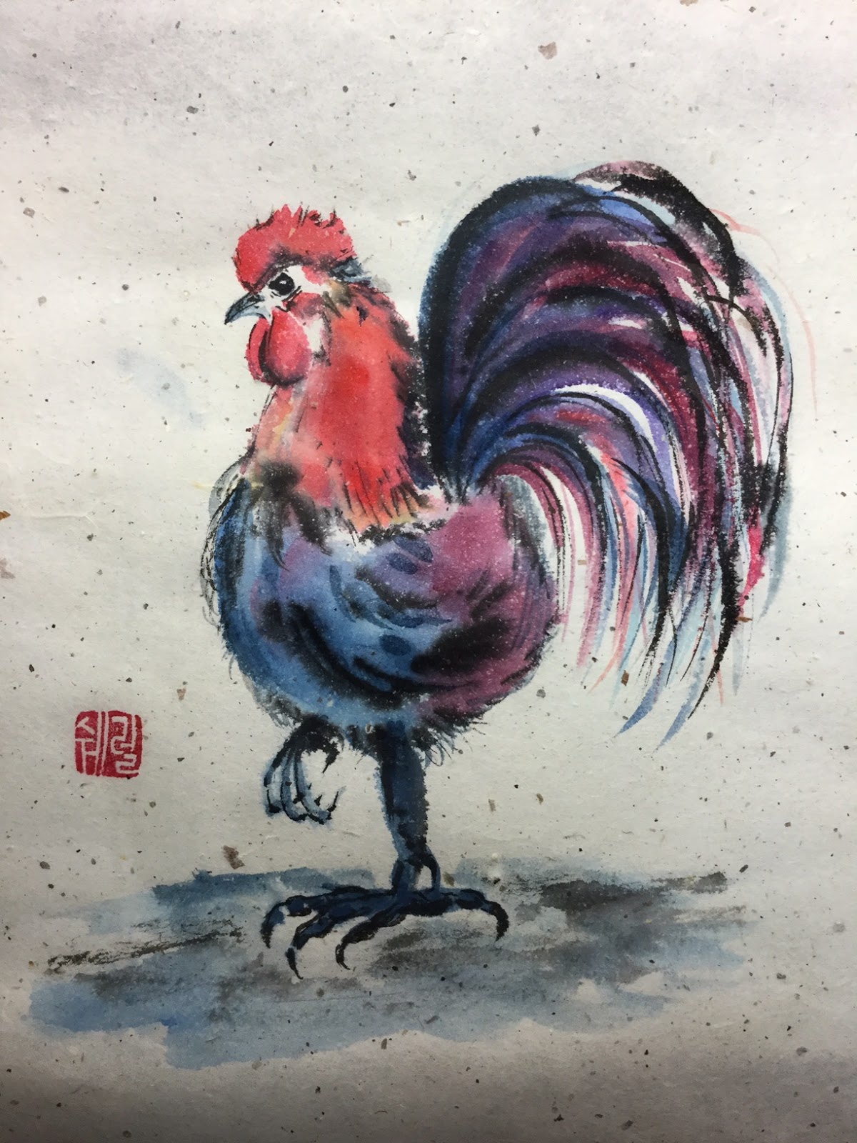
Two weeks ago I joined a Korean landscape painting group, Wolyeonhoe, with perhaps 30 members. I'm not sure really how many are in the group yet, but they have group and individual exhibitions, and a group exhibition is coming up. The group paints every Monday night at the Lyceum, our Korea University Institute for Continuing Education, and everyone basically works on whatever they like -- from photos or webshots. It's a painting-slash-fellowship time of like-minded people to relax socially and artistically at the end of their professional day at work. I LOVE the atmosphere!

So the first night I just dabbled with ink and demonstrated what I knew, and the leader came by and showed me different strokes. Ah! Yes! Techniques on how to manage the ink on such thin hanji (Korean rice paper)! Ink management has been my bane!

Last Monday was a holiday but tonight I came prepared with a picture to paint, a calligraphy landscape by Hong Sung-Mo from his 4th solo exhibition in 2004. I love his light style and delicate brushwork, not the typical heavy brushwork of a lot of Asian painting, but definitely the brushstrokes of someone familiar with western-style watercolor painting. Many of the painting group came over and checked out his exhibition book, which a friend gave me, and really commented what an elegant painter he is! I so totally agree! He doesn't seem to be online, but here's my version of his Tapsa, the temple near Maisan (Horse-ear Mountain) at Jinan, Jeollabuk-do.


Disclaimer, in the early stages I was having trouble managing clean strokes, so the master teacher, a painter of 20 years and very looked up to by the group, came by and demonstrated the quick sketch of Tapsa temple in the upper-right. I wish he did the strokes on another paper, but it's the culture here for the master to paint on the student's paper. It's all a part of the learning process. But wow, after just watching how he quickly dipped the brush in ink rhythmically and swipe it twice before end-brushing the paper really was an epiphany how to control not only the ink but place brush strokes more smoothly!

My first landscape painting! Looking forward to next week 😊 😊 😊 !!!

Saturday, November 3, 2018

Thinkin' o' Somethin' t' Crow About

Day 3 of the Chinese-style painting challenge for November. The challenge is hosted by OASlife (Oriental Art Supply) on Facebook. Marie's Chinese watercolor with Chinese ink on hanji

Day 3 of the painting challenge: Thinkin' o' Somethin' t' Crow About

Friday, November 2, 2018

An Inky Feline

Day 2 of the Chinese-style painting challenge for November. The challenge is hosted by OASlife (Oriental Art Supply) on Facebook, and while the group is hosted by the online Oriental Art Supply market, it certainly is NOT about marketing its product but just holding a forum for like-minded people to paint and interact among themselves at. There's a lot of support among the 563 members, and people dialog on their practice of birds, butterflies or lines, or sometimes the shows or classes they are participating in, or they ask questions on materials. I've joined a lot of painting sites (mostly watercolor) on Facebook over the past year, but this OASlife is one of my favorites. The people are consistent, supportive, not competitive or only marginally, and they offer a great artistic display of talent!

My contribution for Day 2 of the challenge, like yesterday, painted in only 5 minutes, but at least I like this contribution (hanji and Chinese ink): 

Day 2 of the painting challenge: An Inky Feline
Original source

Thursday, November 1, 2018

"Angry-bird" in Chinese Ink

OASlife (Oriental Art Supply) on Facebook holds their annual Asian-style painting challenge for the month of November. Last year I participated even though my first love is watercolor painting, but I learned so-ooo much on a related artform that I decided to join again this year. 

To be more precise what I learned last year: 

  • the importance of just a few strokes to create an image (wasn't very good at this)
  • the importance of a single line
  • the huge importance of value -- a very transferrable skill for watercolor painting!!!
  • learning to use the Chinese watercolors which have more binder than western watercolors (really not much difference. The big difference between the painting mediums is the material which is painted on, not the paint itself!)
  • and of course an introduction to different kinds of papers (the Chinese double and single shuen, raw shuen, semi-sized shuen .... I still don't know how to differentiate these), the Korean hanji paper and the Japanese rice paper, and the two kinds of Japanese shikishi called doobangji in Korea -- the two kinds being a soft shikishi made with mulberry paper mounted on a thin cardboard and the other of a more durable paper mounted on a heavier board and which can take a lot of water abuse!). So true: The paper or the medium that gets painted on is the big controlling factor for the final outcome! This I am continually learning!

So I'm back to learn more this year, but unfortunately this year I'm ultra busy. Tonight I was so tired and just before dropping into bed I remembered that today started the new painting challenge. So five minutes later I submitted and then dropped into bed. I really need to put some more thought into this challenge, or I won't feel good about myself at the end of the month. My shabby five-minute contribution:

Day 1 of the OASlife painting challenge: Evidently day of the angry-bird
Marie's Chinese watercolors on Korean hanji w/ touches of Chinese ink
OASlife members are very supportive, and even feeble efforts are supported, with a few people going out of their way to comment on every contribution ... amazing group support!  So, two back-to-back comments on this bird was: "LOVE the expression on that bird" and "That bird is just too much!" Well, I never saw an emotionally-expressive angry bird before either! 

Monday, November 13, 2017

Cats of a Different Color

Day 13 of the month-long painting challenge, and I'm seriously tired. Not tired of painting, but am trying to juggle a professional job while also doing quality pictures. Well, tonight is a cop-out. I just painted some sketchy cats and gave them a colorful title. Tonight I made sure to use traditional Asian-style paper since the group where I'm posting only uses that kind of paper and not my preferred watercolor stock. Not a keener for the rough-toothed traditional hanji, but it's etiquette to follow the guidelines of the group one participates in, and the proactive viewpoint is it gives me experience with another medium and develops other artistic expressions and strategies.

Cats of a Different Color
Marie's watercolors on hanji, Korean handmade mulberry paper

Friday, September 22, 2017

Painting a Traditional Japanese Basket

Itaewon Global Village Center hosted a special foreigner art class which I could squeeze into my schedule .... making a traditional Japanese basket.

I love traditional handicrafts and putting these baskets together and transforming them into miniature works was art was great. Surprisingly the method is quite simple, but I say that now when we modern people can easily go to the store and buy our supplies and not be dependent on labor-intensive production of said materials. 

First of all, take a simple, light-weight wicker basket. Each of us had a 14" by about 4" deep cheapie basket, a small stack of index-card-size rice paper rectangles, a bottle of glue, and two flat paintbrushes (one for the glue and the other to use as a dry-brush to press down on the glued rice paper). So we all started out by glueing one side of a piece of rice paper and then tacking it down on the wicker basket frame. The idea is to cover the basket, including the top edge, entirely with two layers of rice paper or until the basket is no longer seen through the thin rice paper.


Then we could choose from a variety of decorative rice papers -- the teacher provided both Japanese-style rice paper and Korean-style rice paper for decorating. The two biggest differences between the two papers are that Korean rice paper is much more delicate and, though strong, is so fibrous that it can be torn into shapes with fibrous decorative edges; Japanese rice paper is thicker, tougher and harder to manage delicately shaped tears. That said, Japanese rice paper can be easily cut into shapes; Korean rice-paper doesn't allow easy cutting into the delicate shapes as the paper is thin and crawls around the scissors. The other big difference is the type of design employed on the papers. Japanese rice paper has tiny delicate designs and very vivid and bright colors (see picture immediately below) while Korean rice paper can be bright, or muted, have large designs or small. Since this is a traditional Japanese craft, I chose Japanese rice paper to give my basket a more authentic traditional look.

The ladies at my table were keen on cutting and designing some very unique baskets.


my dragonfly decorated basket (before the stain)

Once the baskets were decorated, we used a blow-dryer to make sure the glue was dry before applying the two layers of natural persimmon dye. I shouldn't have applied the third layer of persimmon dye -- the dark color competes with the red in the dragonflies. But anyway, it turned out very cool looking and we did everything under learning circumstances in 2 1/2 hours.


my traditional Japanaese basket and a dish of sprouts at a Vietnamese restaurant ... must be "Asian Day"
Some of the things I love most: watercolors, Asian calligraphy inks and brushes, and hanji craft!


Without the reflection, the dragonfly dance is rather cool.

Monday, May 8, 2017

Arranging a Marie's Chinese Watercolor Palette

After using the excuse that I don't paint as much as I'd like because I need to put together a wet palette before actually painting a picture (working with wet paint is the way to go), thought I would just bite the bullet and make a "dry" palette, so in the future, seeing a whole arrangement of colors already laid out would inspire me to just grab a paintbrush, a cup of water and sit down. 

I've read the debate between choosing "good" watercolors with rich pigments versus student-grade watercolors with fillers replacing pigments and think there's a lot to be said about starting with the more professional grade. Shinhan Professional Watercolors and Mission Gold Pure Pigment both are quite highly regarded as professional grade while still being reasonably priced -- wonderful! That said, I'd like to paint sometimes on Chinese scrolls which have hanji (Korean traditional handmade mulberry paper) or Chinese/Japanese rice paper, but traditional watercolors aren't designed to be painted on the thinner paper. They bleed horribly. 

According to what I've read ... and seen with Chinese watercolorist Lian Quan Zhen, Marie's Chinese watercolors have a special binder that suits them well for painting on the thinner paper. The names of colors are only written in Chinese but they do have numbers -- not sure what the numbers mean but they can at least conveniently be used for refilling the palette -- so with a 24-watercolor set, arranged and filled my first non-travel palette. 

Paints for rice and other traditional handmade papers

Before filling the 28-well palette, I washed off the residual manufacturing toxins, dried the palette and then buffed the 5 mixing wells with a scrap of sandpaper. Have seen paints don't spread well on glossy plastic so other artists have learned the trick of dealing with the problem -- rough up the plastic a bit.

Of course I arranged the colors in the palette according to my taste. Didn't use the black and at the last minute decided to go ahead and use the white ... might use it to tint a color, who knows. Didn't use one of the greens (#592 and #593 are just too similar, and wish I didn't use one of the blues as #492 and #493 are too similar as well), so that left me with 6 extra wells. Filled those with colors from ShinHan Professional, a Korean brand of watercolors; they are not Chinese watercolors with extra binder so not sure how they'll work, but thought because they extended the color range (5 of them very earthy colors), I would at least add them to the palette and use them on rice paper with caution. [A comment on Marie's 24-set: rather weak on yellows with only #218 and #242. A bit of a surprise as yellow is one of the primary colors, but the many oranges, reds, blues and greens do reflect the more stylized landscape and botanical painting style of Chinese painting.]

Be aware that Amazon markets two different boxes of Marie's watercolors x24 sets. One set has the more traditional range of Western colors (colors are also written in English), and then there are the Chinese watercolors without English and whole different range of pigments, and evidently, binders as well.

Marie's Chinese Watercolors, 24-paint set
Filled the 28 wells with 22 Chinese watercolor paints and 6 Shinhan Professional Watercolor paints
A quick study of a swan
Painted the swan using only two colors only (#495 a Prussian blue and #406 a Bordeaux) and a Micron 001 pen.
Mixed Media drawing-dessin-pastel watercolor 200 g/m paper, 5 3/4" x 8"

Made the classic mistake of beginners ... not maintaining white space to show contrast. Aw well.

Sunday, February 5, 2017

Hanji Tissue Paper Boxes

Tissues boxes made from hanji, the traditional handmade Korean paper made from mulberry fibers. Brought tons of hanji on a vacation visit to give my mom and four of her friends a hanji art class. The ladies kept their own boxes and the rest I made for several of the other elderly church ladies.

Last year I gave an introductory hanji class to most of the same ladies, but when I saw a new line of delicate leaf-shaped hanji that could be layered over other hanji colors (the roll of white fibers -- x4 patterns -- in the upper left-hand corner of the pict below), I got inspired to teach another class, hence the wide variety of colors. So ultimately, many of the tissues boxes ended up with three kinds of hanji: the inner lining that no one typically sees (cheap machine-manufactured hanji), fibrous handmade hanji of many different qualities on the outside, and on several tissue boxes the third layer of handmade delicate, pulpy hanji in leaf and other patterns.


The black or very dark-colored hanji can be applied with various wrinkles and textures, and then when dry, can be gradually bleached with a 40% bleach - 60% water mixture. These fibers were pretty thick but some papers can't take such a high concentration of bleach without destroying the paper fibers.


Gradually after several sessions of wiping and allowing to see the effect, the fibers get lightened and take on character.


THE COMPLETED HANJI TISSUE BOXES

Once all the boxes were made, I applied a couple layers of coating (Korean product) on each to bring out the color and give a protective layer to the fibers. Now all of the boxes can be lightly dusted off with a damp rag to keep them clean and the fibers won't be damaged in the process. 


picture by KD, one of the recipients

Wednesday, December 7, 2016

An Altoid Tin Painter's Palette

Within the past year my artistic side has been awakened. What awakened it was primarily the classes offered through the Yongsan Global Village Center, Seoul, that has held several introduction classes to various mediums and styles of Korean art and handicraft. Some classes were in direct conflict with my working schedule but others I could attend  like classes on hanji and natural soap making  but the two that I can say directly aroused my sleeping artsy side were the Korean calligraphy and the Korean traditional painting classes. They both didn't have fixed outcomes but allowed personal design and creativity, color, nimble fingers with fluid motions. In short, only the imagination was the limit! Both art forms start with clean unmarked papers and the end result is something different, colorful, an expression of the soul. And because of taking those two classes, I now see art everywhere and feel the burning passion to get some of my ideas down on paper. 

This blog, therefore, marks the beginning of my art journey.

Because I see art everywhere and am constantly on the go, I was conniving how to conveniently take art with me, and then I came across a pocket-sized painter's palette on the web, and knew that I had to create one for myself. It took a few months to actually make it, and by that time, a friend thought she'd like one too, so I made two at the same time. Unfortunately I only could get my hands on one altoid tin, so picked up a small well-compartmented plastic container at Daiso, a "dollar" store. Then at an art store I didn't know which clay to choose for molding into a mini-palette form, so bought one Sculpey and one Fimo to test their performance. Fimo definitely is my choice — it's firmer and not so sticky so shaping it with the delicate paint pits is easier and has smoother outcome.


The plastic painter's palette (with Sculpey) is totally self-contained  very nice for the purse or handbag or even a backpack. The altoid tin (with Fimo) is so wonderfully small it's even more portable. The downside of that one, however, is I'll need to pick up some small container or pencil case to have my pencil and eraser, Micron pen(s) and water brush equally easy to grab on the fast go. 


pretty nifty to have a 15-color painter's palette for the road