Showing posts with label watercolor. Show all posts

Wednesday, August 21, 2019

Finch in the Sunflowers

Incomplete summer painting before a long vacation, which obviously the painting is not going along. Inspiration behind the picture was a friend's snapshot posted on Facebook and painted with permission.

Picture by Canadian friend Heinz Volk - painted by permission
taped down on a painter's board for easier transport around the house
the finch three-quarters painted, now the small details are just needed to make the picture pop
a close-up of the finch


Sunday, March 31, 2019

Watercolor Goldfish

A clever way to draw pencil lines that disappear under the watercolor painting is to use the Derwent Graphitint pencils! Basically they are tinted graphite pencils, and for me, all lines were eaten by the first swipe of the loaded watercolor brush. I have a very light hand in whip-sketching so, note to self, will draw a little darker next time. That said, using these pencils is the ultra-way to lay down a quick image and not worry about having to erase, even gently, on the fragile surface of watercolor paper.

Looking very closely light sketching does become apparent. What I like about these Derwent Graphitint pencils is that they are naturally muted tones. Here I used some earthy neutral that, in case it did show, wouldn't look too badly with an orange glow over it.
Daniel Smith watercolors on 10" x 10" cellulose Daler Rowney watercolor paper

Monday, February 25, 2019

Fox in a Rabbit Garden (watercolor)

Experimenting with negative painting! Several months ago I joined the Facebook "Negative Painting Addicted" group and have just admired how some people seem to effortlessly apply negative painting principles. Never heard of it before, so after diligently following the site and being too busy to try, and then now finally trying, wow and yes, addicting even more that I've tried it!

Here's my fun first attempt of negative painting:

Negative painting: "Fox in the Rabbit Garden" 2019

Sunday, October 7, 2018

Butterflies and Sunflowers

A best friend who I hadn't met for 28 years saw my online paintings and asked if I could paint her favorite flowers ... sunflowers! Of course I can. However, even though I love the colors of these, the perspective is a bit off, so will try again. That's how one learns anyway!

Attempted using gauze for the first time. Saw it on-line on Dr Oto Kano's YouTube channel and felt inspired to conveniently paint the textured sunflower centers that way. Only problem is my gauze is so narrow and doesn't stretch, which is fine if treating an injury but not for manipulating texture with watercolor. Note to self: get more gauze because the smaller sections really turned out well!
"Butterflies and Sunflowers" - DS Watercolor, Arches 130# 10" x 14"

Saturday, October 6, 2018

Fish Pond and the Dog

Just a fun watercolor (Daniel Smith) 10" x 14". I'm not a dog person but my friend who wanted me to paint her dog and whimsically wished she could paint it in various minhwa (traditional Korean folk painting style) kind of inspired this piece. The style actually is a combo of minhwa and watercolor. Quite the fun painting to paint, esp getting the water "right", which actually turned out better than I planned.


I prefer this cropped version to the larger 10" x 14" pict (below).
"Fish Pond and the Dog" - DS Watercolor, 10" x 14" Arches 130# hot press

Tuesday, September 25, 2018

Sonja and Dog, Minhwa Painting

Sonja, tea master and minhwa painter (traditional Korean folk), wanted a picture of herself serving tea, her dog that is burned in incredible memory in her brain, and both sitting together under a wild plum tree with a traditional pavilion in the background.

"Serving Tea" - Sonja and Dog
Minhwa-style watercolor
Arches 11" x 14"

Sunday, July 8, 2018

Art Deco Tulips

Day 10/30 of the #30x30DirectWatercolor painting challenge on Facebook. I won't be finishing this paint 30-consecutive-days challenge but it's been fun participating until my busy summer schedule kicks in. I've learned a lot more about color mixing, but mostly I've learned that I've been VERY dependent on presketching the basic shapes before laying down color, which limits spontaneity. I'll have to figure out strategies to develop myself as a more spontaneous painter. One strategy I used was in this painting -- I spontaneously masked with masking fluid where the tulip flowers, stems and fore-leaves would be. The masking created the overall shape of the painting so the rest was easy.

So, the tulips painted yesterday turned out a bit like art deco. I'm not too keen on the Canson cold-press watercolor paper, esp as Manganese Blue Hue Daniel Smith, salt and this paper all create granulating patterns. For this color and paper combo, the granulation process just doesn't work ... the color turns out very flat. Usually I've used Arches hot press paper and have loved how the colors, even Manganese Blue Hue, granulate on that paper. The Canson also buckles badly with much water,  despite being #140 lb. Live and learn. The Canson is inexpensive and is more suitable for casual plein air painting done with waterbrushes and not watery washes.

trial run .... I think I could fix it with a bit more time but wasn't liking how the leaves were turning out
second attempt - the background and main subject colors didn't have enough contrast so added the fine liner inking. Turned out kind of art deco, but kind of cool at the same time.
Art Deco Tulips

Saturday, July 7, 2018

Bees and carnations on scrap paper

Doodling on scrap paper for the #30x30DirectWatercolor painting challenge, and I started liking my doodles better than the tulips I was working on. So here's my doodles paper.

Day 9/30 of the direct watercolor painting, which means directly laying down color without prepping with pre-sketching on the canvas. Thus my reason for "practicing" bees on scrap paper.


Friday, July 6, 2018

Surreal Moose

This was kind of a hilarious painting. Laid some orange down on the paper and absentminded put some blue sky beside it and suddenly the paint was dull. Hah! So I went with it. While I planned on having a vibrant orange painting, the shapes that started emerging were quite interesting .... and so no more orange was added, and the mountains took on a surreal wintry look. Added the moose as an afterthought to balance out the empty foreground. Kind of a bizarre surreal look overall but there is harmony in the end product ... although if someone had said I would be painting moose today, I would have laughed :)

Day 8/30 of the #30x30DirectWatercolor daily painting challenge (no pencil lines, just laying color on paper so rather challenging but definitely developmental).

Surreal moose - lol! 

Thursday, July 5, 2018

Mandril Watercolor

Day 7 of the #30x30DirectWatercolor2018 painting challenge on Facebook. Had a hard time getting the perspective right without making an undersketching, and then had a miserable time getting the color contrast right. I'm realizing one of my biggest weaknesses is not saving white in the paper. Note to self: remember to retain white to get better contrast!

Mandril - Canson Montval 140lb cold pressed, 18.2 x 25.7cm

Wednesday, July 4, 2018

Toucan Popping a Berry

Day 6 for the #30x30DirectWatercolor2018 painting challenge. Now this picture painted directly on paper without preliminary lines or undersketching really worked, and I got the colors pretty well too. I am so in love with the Daniel Smith granulating primateks! They really made this picture great!

Toucan popping a berry

Canson Montval 140lb cold pressed, 18.2 x 25.7cm

Tuesday, July 3, 2018

Horse from the Mist

Day 5 for the #30x30DirectWatercolor2018 painting challenge. It's rather hard but challenging to paint directly, without lines or undersketching. It really helps a person develop ... but if I prefer the undersketching method as I can erase repeatedly until I get the shape and contours I like. And it would be easier to position the objects, case in point, my horse wouldn't be almost standing off the paper. Good development though to practice this way!


Monday, July 2, 2018

Lovely Red Flowers

What a muddle! When I got the flowers painted in, there wasn't enough contrast. Added dark greens and then it was too dark. Added white gouache and then the picture looked weak. More dark touches. A bit more white touches and a white gel pen. Arg! The light picture didn't turn out as I imagined ... but that's learning for you!

This was done for the June #30x30DirectWatercolor2018 June painting challenge on Faebook. My Day 4 entry,. The June painting challenge period has timed out, but I'm just painting what I can and in my own time. The paint-something-daily challenge is a bit of a motivator, now that I have time post-semester.


Day 4 for the June daily painting challenge (yep, it's July but I'm slowly working at my own pace). See #30x30DirectWatercolor2018. This was done using the direct painting method ... no penciling or lines. I did mask directly but that's acceptable since I created those lines directly.

Sunday, July 1, 2018

Field Daisies

Field daisies painted as direct watercolor for a painting challenge. Direct watercolor means no pencil marks, tracing or any guide marks. Reference photos are of course permitted. I didn't really have a reference photo for this ... and it shows. Rather messy.  So there are 2 versions for this:

(1) Direct watercolor using a bit of salt for texturing


(2) Incorporating mixed media: outlining the petals with 0.8 Faber Castell Ecco Pigment


I think I prefer the first one without the outlining of petals.

cold pressed Canson Montval 140lbs - 18.2cm x 25.7cm

Day 3/30 for the direct watercolor painting for the month of June painting challenge. So it's no longer June, I still plan to finish as much as I can, especially as July is watercolor month. See #30x30DirectWatercolor2018 on Facebook for my entries and so many other peoples. It's a great learning and development site.

Saturday, June 30, 2018

Dead Leaf Butterfly

Orange oakleaf, Indian oakleaf, or Dead Leaf butterfly (Kallima inachus) has delicate beauty disguised in folded-wing camouflage. The idea was taken from a video with a single oakleaf butterfly occasionally flicking its wings open and closed.

Dead leaf butterfly .... watercolor in progress
Dead leaf butterfly - 10" x 14" watercolor on 140lb Arches hot pressed
It's the last day of June and I'm just now submitting my second entry for the June painting challenge on Facebook. The instructions are to paint every day and submit it, and the painting should be watercolor that is directly applied to the paper, which means no penciling or sketching in. Just painting on the white paper. Quite challenging. I lightly penciled in the outlines of the butterflies, and I still got the perspective wrong, but at least they are of uniform size.

Friday, June 22, 2018

Watercolor Swans

Swans on Arches watercolor 300g / 140lb hot pressed - 26cm x 36cm / 10" x 14". Daniel Smith watercolors mostly.

WHIMSICAL SWANS


Whimsical Swans

SWANS AT NIGHT

predominantly Indanthrone Blue (DS)


Swans at Night
The Swans at Night was my first entry for the Facebook daily painting challenge for the month of June at #30x30DirectWatercolor2018. It's mid-June and I just found out about the painting challenge. No worries. I don't have to finish. I just need to participate, because by participating, I'm learning.

Sunday, May 13, 2018

Osprey Watercolor

Reference photo from Pinterest. Osprey painted with Daniel Smith watercolors and accents with Micron 005 - Arches 10" x 14" hot press 300g/m 140 lb. But hmm, looks rather like an owl - hoot hoot.

 fishing osprey

Thursday, May 3, 2018

Sonja's Dog: Korean Folk Painting

Since I still haven't delivered Sonja's Minhwa (Korean traditional folk painting) dog painting to her, and because she said she wished she could paint her dog "smoking a pipe" and in other traditional Korean folk story motifs, I was intrigued to try a Korean folk-tale kind of painting. So I mixed up a bunch of Korean folk ideas and put them together for my friend who absolutely loves the traditional in Korea.

Folk ideas blended in this painting:
  • the rabbit in the moon -- the Korean folk view of the moon unlike the western concept of the 'man in the moon'
  • the beginning of a traditional Korean fairy tale is "A long time ago when tigers smoked pipes ..." and usually a pair of rabbits is serving the tiger -- animals are common features of Korean fairy tales, but the reason for coupling rabbits and a tiger in a fairy tale I don't know
  • tigers are often paired with magpies in folk paintings, I'm not sure why again, but do know that magpies by themselves are harbingers of good luck -- so magpies or rather crows get featured with the tiger substitute, the dog, and like the tiger that is painted comically with magpies or pairs of rabbits and wearing a hat, the dog is also comically painted with a hat
  • pine trees are symbols of the scholar and "uprightness" (correctness and Confucianism because of their typically straight appearance
Korean Folk Story Motifs

Friday, April 13, 2018

Choosing Transparent and Opaque Watercolors

As a beginner watercolorist one year ago, I greatly appreciated watercolor artist Steve Mitchell on his YouTube channel, The Mind of Watercolor, explaining that watercolors are not as transparent as most people assume. That piece of info really intrigued me, and I took many of Steve's tutorials on choosing watercolors, papers, brushes, soaking up theory on what I had assumed was just splashing pigment on paper to create a picture. What a great teacher!

I have to say that probably his YouTube clip I most appreciated was his "My Favorite 8 Colors for Watercolor". In it he explained his logic for his favorite eight color preferences. Basically, he avoided opaque colors, which tend to bog down and muddy colors when mixed with other colors, and his preferential eight were colors chosen because of their transparency and luminosity. He stressed that the popular yellow ochre is commonly an opaque "watercolor" (oh really?!), and then Steve proceeded to offer a list of his color palette alternatives in his "How to Avoid Muddy Colors in Watercolor" clip: 
OPAQUE WATERCOLORS (a few of many)
cadmium reds (muddy complements and dull less vibrant colors)
Venetian red (a gorgeous color but weighs down color mixes)
yellow ochre (particularly known for its opacity)
Naples yellow (absolutely opaque in a lot of brands)
cerulean blue (muddies complements and browns)
raw umber (most browns have some opacity, but raw umber particularly so)
black (very opaque in most brands, but why use it when color mixes can achieve the same effect?)  
TRANSPARENT WATERCOLORS, Steve Mitchell's M. Graham preferences 
Payne's gray (for cooling colors) (my research shows most Payne's gray is opaque)
sepia (for warming colors)
azo green
Indian yellow
red iron oxide
quinacridon red
(pyrrol reds are also very transparent)
ultramarine blue
Prussian blue

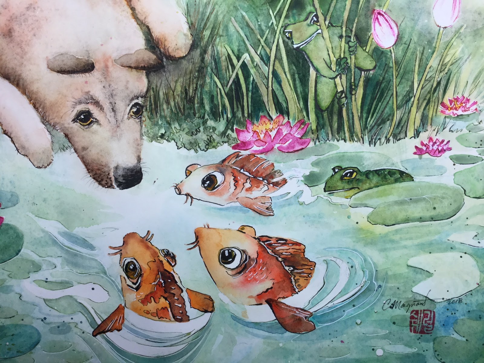
So my first watercolors were M. Graham and nearly the same as the ones Steve had chosen for himself. He's a landscape artist while I like painting animals within landscapes, so different colors are therefore appealing to me. 

However, while I loved the luminosity and the great flow of the M. Graham, they don't travel well because of their high gooey honey base. Now I've branched out into mostly Daniel Smith, yeah, expensive, but I like their wide selection of transparent colors, and I'm experimenting a bit with a few of their Primatek earth colors. Fun indeed!

I've also chosen a few Winsor and Newton, as sometimes a W&N is more transparent than a semi-transparent DS. But, Steve, thanks for giving me a really good foundation in theory and the first steps in application knowledge. I can say that your passion has become my passion!  

Monday, April 9, 2018

Dog Minhwa Painting

A friend who is a minwha painter (traditional Korean folk painter) and who does tea ceremonies here in Korea commissioned me to immortalize her precious dog that passed several years ago but is still treasured in her and her parents' memories. What she wanted was a minhwa-style painting with her Chow-mix dog, a tea table, plum blossoms, and a bug (preferably two as paired animals, birds, bugs express harmony)...... so her ideas transposed to art form on 26cm x 36cm / 10" x 14" Arches pad hot press watercolor paper with Daniel Smith watercolors:


This is mixed media, not just watercolor, as I used Micro pens (0.005, 0.02, and 0.5) for some lines, and a white jel pen for white highlights.