 |
| fishing osprey |

Sunday, May 13, 2018
Osprey Watercolor
Reference photo from Pinterest. Osprey painted with Daniel Smith watercolors and accents with Micron 005 - Arches 10" x 14" hot press 300g/m 140 lb. But hmm, looks rather like an owl - hoot hoot.


Thursday, May 3, 2018
Sonja's Dog: Korean Folk Painting
Since I still haven't delivered Sonja's Minhwa (Korean traditional folk painting) dog painting to her, and because she said she wished she could paint her dog "smoking a pipe" and in other traditional Korean folk story motifs, I was intrigued to try a Korean folk-tale kind of painting. So I mixed up a bunch of Korean folk ideas and put them together for my friend who absolutely loves the traditional in Korea.
Folk ideas blended in this painting:
- the rabbit in the moon -- the Korean folk view of the moon unlike the western concept of the 'man in the moon'
- the beginning of a traditional Korean fairy tale is "A long time ago when tigers smoked pipes ..." and usually a pair of rabbits is serving the tiger -- animals are common features of Korean fairy tales, but the reason for coupling rabbits and a tiger in a fairy tale I don't know
- tigers are often paired with magpies in folk paintings, I'm not sure why again, but do know that magpies by themselves are harbingers of good luck -- so magpies or rather crows get featured with the tiger substitute, the dog, and like the tiger that is painted comically with magpies or pairs of rabbits and wearing a hat, the dog is also comically painted with a hat
- pine trees are symbols of the scholar and "uprightness" (correctness and Confucianism because of their typically straight appearance
 |
| Korean Folk Story Motifs |
Friday, April 13, 2018
Choosing Transparent and Opaque Watercolors
As a beginner watercolorist one year ago, I greatly appreciated watercolor artist Steve Mitchell on his YouTube channel, The Mind of Watercolor, explaining that watercolors are not as transparent as most people assume. That piece of info really intrigued me, and I took many of Steve's tutorials on choosing watercolors, papers, brushes, soaking up theory on what I had assumed was just splashing pigment on paper to create a picture. What a great teacher!
I have to say that probably his YouTube clip I most appreciated was his "My Favorite 8 Colors for Watercolor". In it he explained his logic for his favorite eight color preferences. Basically, he avoided opaque colors, which tend to bog down and muddy colors when mixed with other colors, and his preferential eight were colors chosen because of their transparency and luminosity. He stressed that the popular yellow ochre is commonly an opaque "watercolor" (oh really?!), and then Steve proceeded to offer a list of his color palette alternatives in his "How to Avoid Muddy Colors in Watercolor" clip:
I have to say that probably his YouTube clip I most appreciated was his "My Favorite 8 Colors for Watercolor". In it he explained his logic for his favorite eight color preferences. Basically, he avoided opaque colors, which tend to bog down and muddy colors when mixed with other colors, and his preferential eight were colors chosen because of their transparency and luminosity. He stressed that the popular yellow ochre is commonly an opaque "watercolor" (oh really?!), and then Steve proceeded to offer a list of his color palette alternatives in his "How to Avoid Muddy Colors in Watercolor" clip:
OPAQUE WATERCOLORS (a few of many)
cadmium reds (muddy complements and dull less vibrant colors)Venetian red (a gorgeous color but weighs down color mixes)yellow ochre (particularly known for its opacity)Naples yellow (absolutely opaque in a lot of brands)cerulean blue (muddies complements and browns)raw umber (most browns have some opacity, but raw umber particularly so)black (very opaque in most brands, but why use it when color mixes can achieve the same effect?)
TRANSPARENT WATERCOLORS, Steve Mitchell's M. Graham preferences
Payne's gray (for cooling colors) (my research shows most Payne's gray is opaque)
sepia (for warming colors)
azo green
Indian yellow
red iron oxide
quinacridon red (pyrrol reds are also very transparent)
ultramarine blue
Prussian blue

So my first watercolors were M. Graham and nearly the same as the ones Steve had chosen for himself. He's a landscape artist while I like painting animals within landscapes, so different colors are therefore appealing to me.
However, while I loved the luminosity and the great flow of the M. Graham, they don't travel well because of their high gooey honey base. Now I've branched out into mostly Daniel Smith, yeah, expensive, but I like their wide selection of transparent colors, and I'm experimenting a bit with a few of their Primatek earth colors. Fun indeed!
I've also chosen a few Winsor and Newton, as sometimes a W&N is more transparent than a semi-transparent DS. But, Steve, thanks for giving me a really good foundation in theory and the first steps in application knowledge. I can say that your passion has become my passion!
Monday, April 9, 2018
Dog Minhwa Painting
A friend who is a minwha painter (traditional Korean folk painter) and who does tea ceremonies here in Korea commissioned me to immortalize her precious dog that passed several years ago but is still treasured in her and her parents' memories. What she wanted was a minhwa-style painting with her Chow-mix dog, a tea table, plum blossoms, and a bug (preferably two as paired animals, birds, bugs express harmony)...... so her ideas transposed to art form on 26cm x 36cm / 10" x 14" Arches pad hot press watercolor paper with Daniel Smith watercolors:


This is mixed media, not just watercolor, as I used Micro pens (0.005, 0.02, and 0.5) for some lines, and a white jel pen for white highlights.
Sunday, March 18, 2018
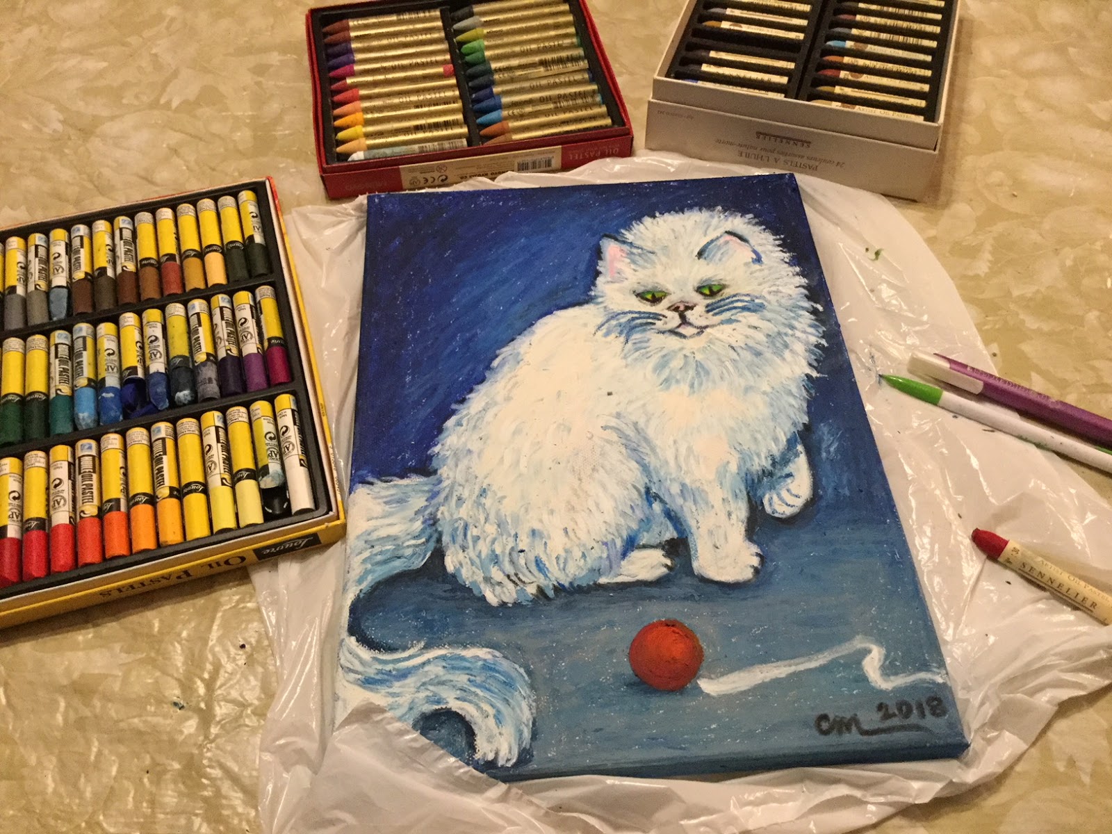
White Cat in Oil Pastels
Jerry's Artarama had a sale on Sennelier oil pastels around Christmas time. Such rich oil pastels! I'd heard of them and then at an art store felt their honey-like richness, but just wasn't going to pay $2.80 per stick, so when someone told me I should give some oil pastels to try, I settled for a 48-piece Louvre set. Hmmm. Waxy and disappointing. I'm not sure how Crayola crayons layer on a paper or board, but I'm certain they go on with less wax. Anyway, the 48-piece Louvre set was significantly cheaper than the much touted Sennelier: the Louvre set, around $22 or $23, while a single Sennelier oil pastel stick is $2.80. Nope. But with Jerry's Artarama Christmas sale, thought I would take the plunge and buy the 24-piece Still Life set that was marked way down to $29.95, even $10-15 cheaper than the on-sale Portrait, Landscape and other 24-piece set.
So here's my little test drive of the oil pastels. Since this was such a large canvas for such a small set, for background I first used the Louvre set to save my precious expensive Sennelier. Then over that I applied the creamier Mungyo oil pastels, which in South Korea cost me under $10 for a set of I think 24. They are pretty creamy and apply quite smoothly with moderate build-up. (I do recommend this brand! Quite smooth and blend fairly well.) Only then, on top of the cheaper oil pastels did I start to apply the richer, even more buttery Sennelier brand.
I'm amazed at how quickly a picture can be created with this medium. The layering is fast and easy, and adjusting and disguising mistakes is a piece of cake. However, my big issue with oil pastels is .... I can't create finer detail. To finalize on a picture I want to flick out a long thin whisker or put in a specific broken moon reflection in the eye, but oil pastels are more for impressionistic painting. Fun, but my first art medium is still definitely the wildness and unpredictableness of water color!
 |
| getting the background first |
 |
| picturing only the Louvre oil pastel set |
 |
| picturing all three sets of oil pastel used: first the Louvre, then Mungyo, and finally Sennelier |
 |
| Oil Pastel Cat |
Wednesday, February 28, 2018
Derwent Inktense Color-swatch Chart
Derwent 72-color Inktense are gorgeous, rich, and intense. I also recently bought the Derwent Artbars, very different on many levels, but I will make some basic compare-and-contrast statements that aren't commonly written about.
Derwent Inktense (72 colors)
|
||
Medium
|
Watercolor paints. Can be reactivated every time the
painting is dampened, so layers are fragile and can be disturbed, but they
allow more spontaneity as they can be changed if desired.
|
Ink—once activated
with water and dried, doesn’t reactivate so takes layers very well! Once
permanent, cannot be changed, so plan ahead.
|
Intensity
|
Pastel-like. Colors are grouped into four categories:
brights, lights, earths, darks. I found the lights almost too pastel to be
very useful. Marigold and carnation in the brights also extremely pale as
were a couple in the earths (spice and Mediterranean especially).
|
For the most part these colors are powerful. A few like
saddle brown, baked earth and willow and a couple of others were weak on
intensity, but then I was only color-swatching and wetting with one steady
swipe.
|
3-4cm crayon-like application and
activation with water (one-swipe)
|
Activate quickly
and the color is very smooth and evenly distributed.**** Applause, applause!
|
Activate quickly but consistently streak affecting even
distribution of color.
|
Residue after one-swipe activation of
crayon swatch
|
About 80% “melted” by the water
|
About 70% “melted” by the water
|
Color pulls down in 6-7 inch swatches
|
Color pulls down smoothly, easily, and except for lights, consistently
|
Color pulls down easily and consistently but in streaks
|
Uses for me
|
On paper just like traditional watercolor paints, but they
can be used to draw and then activated with water.
|
On paper light traditional paint, as a crayon and activated, and on cloth with textile medium—all permanent
once dried.
|
Both of these mediums easily activate with a damp paintbrush
on the bars themselves, eliminating the need for a palette or clean-up after
painting—for me in my tiny apartment, this is phenomenal! Easy set-up and
easy put-away!
| ||
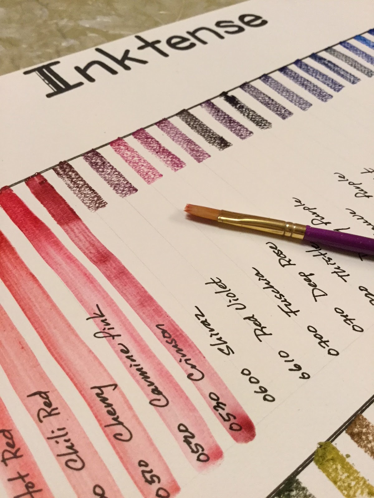 |
| awesome color, but note the streaking with the one-swipe water activation of the crayon-like application to paper |
 |
| Derwent Inktense color-swatches (compare with Derwent Artbars) |
 |
| I was rather surprised that the Inktense set didn't come with a list of color names, but only had 4-digit numbers on each of the bars. Some of those numbers were very hard to see too. I actually had to go online to get a list of the color names to match the numbers, a bit of an inconvenience! Then, thank goodness, I carefully checked each of the 4-digit numbers to the name on the list and found an error. There was no "Outline #2400" but I did have the Unknown blue color #1215. Very odd, with double meaning to that word as it was the only odd number in the 72-color set. All other bars were numbered roughly in 10-number increments. One of the reasons I checked the numbers before just labeling the bars is someone else online had complained of getting two bars of the same green color; she wrote the seller and was immediately sent the missing color. For me it's really no big deal, since at least all 72 of my colors are uniquely different. |
 |
| After making sure of color of each bar, I labeled each so I can easily document which colors are used on future paintings. |

 |
| And now all of my colors are clearly labeled and ready to use. Also note the little yellow tabs on the top pan. I put a cardboard piece under the fragile plastic form and attached the yellow tabs so I can easily pull the thin plastic palette out without damaging it. Now it feels quite durable and should last a good long time! |
Wednesday, February 21, 2018
Painting Matryoshka x3
Getting a headstart on Christmas presents for 2018, and since my niece and nephews love playing with two matryoshka nesting doll sets I brought from Russia years ago, thought I would paint each of them their own set. (For interest, here's a history of the stylish matryoshka.)


Painting those little 5 1/2" dolls on the woodblocks was a lifesaver. The dolls were easy to hold, turn and I didn't get acrylic on me while painting or setting them down, and I didn't spray myself with the shellac either. Really nifty. They were glued down with glue sticks which was easily removable after painting.

WILD CATS for the oldest:


TRADITIONAL DOLLS for the niece:


SEA ANIMALS for the youngest:


So come Christmas the kids will have their own matryoshkas to play with!


Subscribe to:
Posts (Atom)