Day 2 of the November painting challenge for OAS (Oriental Art Supplies).
Thursday, November 2, 2017
Wednesday, November 1, 2017
Cranes at Sunset
Oriental Art Supply (OAS) on Facebook is hosting a November painting challenge with the idea of promoting people's creativity by challenging them to paint something along the lines of Oriental-style painting every day and posting it on the OAS Facebook site. Inktober passed and I never did a piece of art. Sad. I've only been inspired to paint since the beginning of this year, and haven't done much. So OAS, challenge accepted. My first contribution:
![]() |
| "Cranes at Sunset"
Mixed media: M Graham watercolors and Chinese Xeno small brush pen on Arches hot-pressed 140lb paper (3.9” x 9.8”)
|
Sunday, October 15, 2017
24-watercolor Mixing Chart: Shinhan SWC and M. Graham
So I've spent a few hours "learning" my first professional watercolor palette set. The set is a combination of M. Graham and SWC -- the SWC ShinHan Watercolor Professional, not to be confused with tubes that read just ShinHan Watercolor Professional. Yes, confusing! Pictures below to exemplify the difference.
| my first professional watercolor palette Combination of 11 M. Graham, 11 SWC ShinHan Watercolor Professionals, and 2 ShinHan Watercolor Professionals |
Wow, did I learn a lot about color combinations from making this chart: which colors are likely to muddy when combined, which ones become opaque, which are heavily or lightly pigmented, or redundant colors, and which ones become beautiful rich blacks. I'm already figuring out what my ultimate preferred color palette will be...
The 2 ShinHan colors aren't heavily pigmented but wow do they lay color on the paper well and have rich smooth texture. It'll be hard replacing them because they're so enjoyable to use. The downside for them is I end up using a lot of paint and made significant holes in the palette cubes. In the long-run it'll be cheaper to use a more pigmented paint. I chose those colors, however, because they are transparent (my whole palette is except the semi-transparent Payne's Gray and Sepia) and because I liked how they completed my range of palette colors.
Just an aside, ShinHan watercolors, though student grade watercolor, are quite brilliant and very smooth and rich. Alpha, another old watercolor brand here Korea and also student grade, is quite inferior (my opinion) -- colors don't lay down smoothly, not as rich, perhaps chalky. I don't enjoy painting with them at all. Mission is a new Korean watercolor brand that has recently come onto the market. I haven't used them, but they are said online to be quite beautiful. I'd buy a set of them, but for two reasons: many fugitive colors, and Mission sets are heavy into reds but weak in the blues and greens. I'm interested in painting animals, not floral arrangements so they don't suit me.
I really like all of the SWC paints that I chose, except one -- Cobalt Light Violet. While it's a very beautiful color, it isn't heavily pigmented at all and doesn't lay down smoothly on the paper. Kind of streaky, in fact. Other colors easily over-power it, which is not a problem really, it's just streaky. There is only one other weakly pigmented color, also a SWC color: Terre Verte (Yellow Shade), and I won't be replacing it because I absolutely love it! Gorgeous soft color that when combined with some other colors becomes opaque. Interesting effect rather than annoying. I really dug my brush into this color and had to refill the paint cube while with other cubes I was barely skimming the top, but I'll definitely be keeping this color in my palette! Combines beautifully with almost every color in my palette too!
The M. Graham paints are glorious, and most richly pigmented, even more than the SWC paints. The only bone I have about M. Graham is that they are rather runny. I've noticed that in the past couple of days when the weather has gotten much cooler -- in the 60s and low 70s -- the paints have finally made a film on the surface. Finally, after many many days of leaving my palette open! I don't think I'll keep buying M. Graham because I use my paints also in an Altoid tin for on-the-go. My goodness is that tin a mess! Not much fun painting when colors are swimming into each other.
Changes to My Future (Perfect) Palette
Not sure about the "perfect" palette yet, but I think the future paints I buy, if I can't find the transparent colors I want with SWC watercolors, are Daniel Smith. D.S. has a huge range of colors (too many to choose from ... having trouble!) and they aren't messy for plein air painting. They aren't available here in Korea to my knowledge, which is fine as name brand art stuff has a stiff mark-up in Korea. I'll order them off either Dick Blick or Jerry's Artarama for discounted price, and have them sent to an American address for free shipping and handling. That way, nice paints then become affordable paints.
Necessary changes:
- Bordeaux (ShinHan) - redundant color with SWC Crimson Lake (remove)
- Red Violet (ShinHan) - lovely but not highly pigmented; replace with Quin Magenta (D.S.)
- Cerulean Blue Hue (SWC) & Peacock Blue (SWC) - both PB 15:3 as is Phthalo Blue (M.G.) and nearly identical when mixed; remove both and replace with Manganese Blue Hue (D.S.)
- Burnt Umber (SWC) and Red Iron Oxide (M.G.) - too similar; replace Burnt Umber with Bronzite Genuine (D.S.)
Other changes:
- Hansa Yellow (M.G.) and Azo Yellow (SWC) are quite similar; replace Hansa Yellow with Lemon Yellow (D.S.)
- Quinacridone Gold (D.S.) is so amazingly beautiful; replace Indian Yellow (SWC) with Quin Gold
- Goethe (Brown Ocher) Genuine (D.S.) is granulating and Raw Sienna (SWC) is not; replace Raw Sienna with Goethe Genuine (semi-transparent) or Yavapai (natural iron oxide) Genuine (transparent and a bit lighter, more like a sand color)
- Mayan Blue Genuine (D.S.) add; it's incredibly rich and 4 blues in a 24-color palette seems appropriate
- Cobalt Light Violet (SWC) just doesn't lay down smoothly; replace with perhaps Wisteria (D.S., semi-transparent though and non-granulating) or Ultramarine Red (D.S., transparent but granulating)
Tuesday, October 3, 2017
My First Professional Palette
I've played around for the last 6 months or so with student quality or dollar store paints, and after seeing the more professional people successfully lay down beautiful colors that flow and gently blend into each other, I've taken the time to put a palette together. The first picture I did a few days ago with the pro paints was satisfying -- those colors just happily mixed and there was less "bloom" with the pro colors!
So originally I bought a $14 set of cheapie AQUAnaut paints off Amazon. Thought I would pop the colors out and use them like chalk for something ... but then decided that it was too much effort. I really liked the paintbox -- it efficiently holds and organizes 24 colors on one side of a box, it's metal so won't stain, and best of all, it's compact with no detachable parts and can be clipped to a palette board for a simplistic plein air style of painting! Went to Hangaram, one of the biggest local art stores here in Seoul, and found the very same paintbox. Yep, bought it.
And since I was setting up my professional "large" paintbox, I also put together yet another Altoid box of paints, this one professional. Paints used were an eclectic mix of M. Graham and SWC (ShinHan Water Color Professional).
So originally I bought a $14 set of cheapie AQUAnaut paints off Amazon. Thought I would pop the colors out and use them like chalk for something ... but then decided that it was too much effort. I really liked the paintbox -- it efficiently holds and organizes 24 colors on one side of a box, it's metal so won't stain, and best of all, it's compact with no detachable parts and can be clipped to a palette board for a simplistic plein air style of painting! Went to Hangaram, one of the biggest local art stores here in Seoul, and found the very same paintbox. Yep, bought it.
And since I was setting up my professional "large" paintbox, I also put together yet another Altoid box of paints, this one professional. Paints used were an eclectic mix of M. Graham and SWC (ShinHan Water Color Professional).
| Left - $14 AQUAnaut set for experimenting with; Middle - my new Altoid box of professional paints; Right - my M. Graham and SWC professional paint box. |
| After setting up my paintbox, I put a little watercolor art on the back of the paint box color swatch sheet. |
| Professional paints in a box for on-the-go painting. |
| My all-new professional paintbox: studio and plein air sizes. |
Saturday, September 23, 2017
Painting Cheetah Cubs
Three cheetah cubs, painted on Arches hot-pressed 300 g/m 140 lb paper - 3.9" x 9.8"
First time to use professional watercolor paper and my first set of professional watercolor paints (mostly transparent) -- a combination of Shinhan Watercolors and M. Graham.
Colors used: (M Graham) Transparent Red Iron Oxide, Payne's Gray, Ultramarine Blue with a touch of Phthalo Blue, and (Shinhan) Terre Verte (Yellow Shade), Raw Sienna, and Indian Yellow.
First time to use professional watercolor paper and my first set of professional watercolor paints (mostly transparent) -- a combination of Shinhan Watercolors and M. Graham.
Colors used: (M Graham) Transparent Red Iron Oxide, Payne's Gray, Ultramarine Blue with a touch of Phthalo Blue, and (Shinhan) Terre Verte (Yellow Shade), Raw Sienna, and Indian Yellow.
![]() |
| "Three Cheetah Cubs", painted on Arches hot-pressed 300 g/m 140 lb paper - 3.9" x 9.8" |
Friday, September 22, 2017
Painting a Traditional Japanese Basket
Itaewon Global Village Center hosted a special foreigner art class which I could squeeze into my schedule .... making a traditional Japanese basket.
I love traditional handicrafts and putting these baskets together and transforming them into miniature works was art was great. Surprisingly the method is quite simple, but I say that now when we modern people can easily go to the store and buy our supplies and not be dependent on labor-intensive production of said materials.
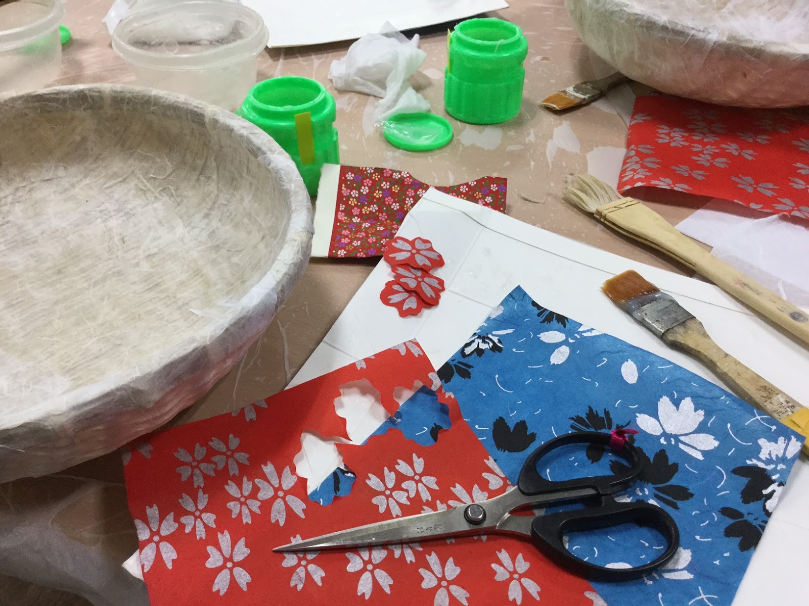
First of all, take a simple, light-weight wicker basket. Each of us had a 14" by about 4" deep cheapie basket, a small stack of index-card-size rice paper rectangles, a bottle of glue, and two flat paintbrushes (one for the glue and the other to use as a dry-brush to press down on the glued rice paper). So we all started out by glueing one side of a piece of rice paper and then tacking it down on the wicker basket frame. The idea is to cover the basket, including the top edge, entirely with two layers of rice paper or until the basket is no longer seen through the thin rice paper.
Then we could choose from a variety of decorative rice papers -- the teacher provided both Japanese-style rice paper and Korean-style rice paper for decorating. The two biggest differences between the two papers are that Korean rice paper is much more delicate and, though strong, is so fibrous that it can be torn into shapes with fibrous decorative edges; Japanese rice paper is thicker, tougher and harder to manage delicately shaped tears. That said, Japanese rice paper can be easily cut into shapes; Korean rice-paper doesn't allow easy cutting into the delicate shapes as the paper is thin and crawls around the scissors. The other big difference is the type of design employed on the papers. Japanese rice paper has tiny delicate designs and very vivid and bright colors (see picture immediately below) while Korean rice paper can be bright, or muted, have large designs or small. Since this is a traditional Japanese craft, I chose Japanese rice paper to give my basket a more authentic traditional look.
The ladies at my table were keen on cutting and designing some very unique baskets.
| my dragonfly decorated basket (before the stain) |
Once the baskets were decorated, we used a blow-dryer to make sure the glue was dry before applying the two layers of natural persimmon dye. I shouldn't have applied the third layer of persimmon dye -- the dark color competes with the red in the dragonflies. But anyway, it turned out very cool looking and we did everything under learning circumstances in 2 1/2 hours.
| my traditional Japanaese basket and a dish of sprouts at a Vietnamese restaurant ... must be "Asian Day" |
| Some of the things I love most: watercolors, Asian calligraphy inks and brushes, and hanji craft! |
![]() |
| Without the reflection, the dragonfly dance is rather cool. |
Wednesday, July 26, 2017
Labeling the Garden: Garden Signs
![]() |
| free-handing the lettering for the labels (notice my "new" and very first router! Had to put that in the picture because it promises new woodworking projects in the future!) |
![]() |
| After cutting the outlines of the words out, had to drill holes to insert the blade to cut out the inner parts of the letters (erg, what a lot of time) |
![]() |
| Labels cut and sanded, and ready for painting |
![]() |
| The yellow and red should show up nicely in the greed of the garden! |
![]() |
| "hot" colors for veggies, and "cool neutrals" for the herb garden |
Subscribe to:
Posts (Atom)