Pages

Thursday, December 28, 2017

Color Theory - Those Tertiary Colors!

Claudia Nice, author of Painting with Color, Pen and Ink (2002), is an artist that resonates with my developing painting interests and style. Our artistic approaches: transparent watercolors with touches of ink! 

And when I saw her color wheel, I realized that our favorite color choices (the mixed colors) fell in the same color range as well. What I also realized from her color wheel below is that those favorite color mixes were equally spaced on the color palette and principally are tertiary colors. What an eye-opening moment for me! So I'm documenting this moment and in a year or two I'll look back and see how my color choices have changed and/or developed. The future of painting for me is ... still an open palette.

Color wheel taken from Painting with Color, Pen and Ink by Claudia Nice, p 11
color chart based on Grumbacher watercolors
Her colors of choice (grumbacher watercolors) are:
1. gamboge
2. thalo yellow green
3. yellow ochre
4. sap green
5. thalo green
6. burnt sienna
7. sepia
8. brown madder
9. burnt umber
10. payne's gray
11. thalo red (hard to replicate by mixing) 
Another note, Claudia never mentioned red iron oxide in her color choices, but this one, definitely a tertiary color as well, is an absolute must for my palette at the moment! Of course I would switch out several of the colors, but in principle, we have the same taste in color range, which reflects our choice in subject - for Claudia a range of landscape and wildlife, and for me more limited to wildlife in natural settings. 

I have to say, until now my choices of color and paint (M Graham watercolors) have been heavily influenced by Steve at Mind of Watercolor. The limited palette Steve introduced I very much love and several of them will probably always be in my limited palette as well: azo green, indian yellow (or new gamboge), and transparent red iron oxide. 

This chart evoked an interesting realization of the range in which my favorite colors fall -- the tertiaries, principally the earthy reds and greens!

Saturday, December 16, 2017

Comparing Louvre and Mungyo Oil Pastels

There's really not much online info about either the Louvre or Mungyo Oil Pastels, but I've gotten interested in the oil pastels since the month of "Inktober" when I had met an American who was greedily purchasing the open stock Sennelier brand at Hangaram, my favorite art store here in Seoul. We started talking and she was telling me about what she planned to do with the oils and was thinking that watercolor cold-press might be a good match to lay down the color on. Hmm, I'd seen lots of oil pastels before and even purchased many sets for kids, but I'd never taken them as a serious artist medium. After talking with her though, they started to intrigue me so a couple weeks later I decided to purchase a set. Certainly not Sennelier oil pastels since they are W2,800 per stick, but a set that seemed inexpensive mid-range -- the Louvre 48-color oil pastels for W23,000. 

As soon as I got home, I tried them out. Nope, not an alluring art form for me. No love. Just like coloring with crayolas. I knew they wouldn't be creamy-smooth like the Senneliers, but I didn't expect waxy crayon consistency (just slightly better really) and the need to apply firm pressure to get the colors to adhere to a sturdy rough sketchbook paper. My impression -- crayons at a glorified price. 

I went online and tried to read about them, but couldn't find much. The wrappers on the pastels give a French website but clearly state they are manufactured in China. With no info on the box, I should have been clued in that they wouldn't be super good. My bad. Anyway, while looking at oil pastels online, a couple artists who didn't want the expense of the Senneliers had commented on the creaminess of the Mungyos. I just filed that info away, but with no desire to test it out.

So today, I wanted to pick up a 24-color or even 36-color Mungyo Watercolor Crayons set as the 12-color set had been such a success with my neiceling and nephew a few days ago. And what do you know, right beside the set of 24 watercolor crayons (W7,200 or about $7) was a 24-color set of Mungyo Aquarelle Oil Pastels for W6,300. For that price, why not? I could try something out, and then if I didn't like them, my neiceling and nephew and I could spend a winter afternoon just having fun with them and they would be well worth the money.

I have to say though, the Mungyos are a pleasure to use. Really fun in fact. The are quite creamy (not like the Senneliers but still nice) and just touching them to the paper leaves an oily trail of color. Like the Louvres, they do leave crayon-line waxy flakes, but those waxy flakes can be easily pushed into the paper or wiped in a color-trail across the paper with the finger. The Louvres don't manipulate much. That said, it means the Mungyos smear more easily, which I realized after my little cactus drawing was nearly done. In the future, I'll just use a piece of wax paper to buffer my hand and protect my drawing. 

Here's a comparison using the greens and yellows of the Louvre 48-color set and the Mungyo 24-color set. Despite using more Louvre colors, Mungyo achieved the same richness with fewer. They were easier to lay down and blend (the yellow petals). In my opinion, the only way the Louvre had the edge on Mungyo is the pastels would be much easier for doing finer drawing as they are much harder and can hold an edge necessary for more detailed work.

Comparing Louvre Oil Pastels on the left & Mungyo Aquarelle Oil Pastels on the right
(left) Louvre oil pastels used - 1 dark blue, 5 greens, 4 yellows, 1 orange
(right) Mungyo aquarelle oil pastels used - 1 dark blue, 3 greens, 2 yellows, 1 orange
The Mungyos were much easier to lay down color,  and I did intentionally smudge the yellow petals a bit on the Mungyos, a technique that didn't work so well with the Louvre pastels.
After comparing their colors, thought I'd test out the aquarelle aspect of the Mungyos. Just lightly flicked the base of the cactus barrels with a firm damp brush and the colors, even on the first stroke, flicked up the barrels. I flicked a brush 3-4 times on the largest barrel (at the base) and realized the brush was picking up the color and the contrast was disappearing. Must remember this! The Mungyos both smear easily across the paper (I think a positive point) and respond quickly to even the lightest touches of water.

For me, this means I have found an art medium for laying down quick medium and making quick adjustments to spread that color with minimal effort. Yep. Definitely like the Mungyos!
Made this the day I bought the Louvre oil pastels. Laid down the oil color quite thickly but the sketchbook paper could still be seen through. (Same paper as the cacti above.) Then, as I saw online, dipped a wide firm brush in coconut oil and used the oil as a medium for adjusting the colors. Discovered the colors responded quite differently. The red, orange and pink blended adequately with the coconut oil, and I really worked at blending the blue of the "M" (meh, am not a keener), but the light purple pretty much refused to blend -- very waxy and crayon-like. Then, to test how much color I was picking up and moving, started swiping the page with the "loaded" brush. It's obvious the brush wasn't loaded and the colors didn't shift much ... They are just glorified crayons after all. 

Friday, December 15, 2017

Watercolor Turtle

For my New Year's gift to myself am ordering a bunch of Daniel Smith watercolors. Last winter I ordered my first professional grade watercolors, 11 tubes of M Graham. And I absolutely love how juicy and rich the M Graham colors are, and how transparent they are! But their one downside, and it's a big one, is that their formula has honey (thus their juicy-ness) and so they make quite the mess in my little Altoid tin. 

Yeah, I could just order a small set of another brand for plein aire, but I'm traveling so much, in hot weather in the summer time and dropping my backpack on the heated Korean floors in the winter time, making those paints flow like honey, so I'd prefer to just order a large set of "firmer" paints so that not only my Altoid tin could be grabbed but any sized palette I have could be dropped in my backpack on a moments notice. After reading about pigments and checking on transparency, decided on Daniel Smith. I'll also get a few Winsor and Newton too because I prefer some of their pigments or coloration.

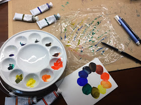
Anyway, pulled out my M. Grahams tonight and realized that 10 of the 11 colors would fill a small 10-dish ceramic palette, so set it up and had some fun!

First background attempt for the background, using water and colors on seran wrap, didn't work out for me. Great idea though and will attempt it again in the future.
M Graham: hansa yellow, azo orange, scarlet pyrrol, transparent red iron oxide, sepia, Payne's gray, phthalo blue, ultramarine blue, phthalo green, azo green
laying down background colors (phthalo blue and ultramarine blue) on a semi-wet paper 
Misted the damp background with 91% alcohol and got an instantly mottled look.
Laid down some colors on the turtle -- azo green transparent red iron oxide and then touches of sepia
simple watercolor turtle on New Soho series SKETCH paper - 5" x 7"

Thursday, December 7, 2017

Yeoksam Global Village Center Art Exhibition and Charity

The Yeoksam Global Village Center hosted their "9th Yeoksam Winter's Tale" in the form of a charity art exhibition. All art pieces were made by foreigners and some would be sold to generate money for charity for the House of Sharing which is a home dedicated to the care and well-being of the aging "comfort women" and a children's hospital. So I joined the event, and 13 of my small paintings that I had done during the November painting challenge got displayed. Great timing actually as my November painting challenge had just come to a close and I still had the paintings on hand.


The 15 pieces closest to this end are my works on display.
Though this was only an amateur display of art -- and a very fun display of art at that -- I was proud to be a part. Am not sure how much money was generated by the event, but the participation process was very satisfying.

The pictures with descriptions that I contributed:
1. [Panda in Bamboo] Pandas are associated with bringing abundance and prosperity, and as a feng shui symbol they represent masculine energies. Therefore, a panda or bear figure is placed in the home (main entrance best) to protect the house and its inhabitants.
Watercolor and Chinese ink on doobangji (shikishi board) 18cm x 21cm 
2. [Fish in Hokusai Waves] An alternative viewpoint of the famous painting “Great Wave off Kanagawa” by the famous 18th century Japanese artist Hokusai.
Finetec metallics and Chinese ink on doobangji (shikishi board) 18cm x 21cm 
3. [Birdsong] Haiga is the Japanese art of painting nature and writing a haiku-like poem on the painting to express sentiment the scene evokes.
Watercolor and Xeno brushpen on doobangji (shikishi board) 18cm x 21cm 
4. [May All Your Weeds…] Haiga is the Japanese art of painting nature and writing a haiku-like poem on the painting to express the sentiment the scene evokes.
Watercolor and Xeno brushpen on doobangji (shikishi board) 18cm x 21cm 
5. [Golden Koi] Fish that swim in pairs, like birds and cranes pictured together, are feng shui symbols for marital bliss.
Watercolors and Finetec metallics on doobangji (shikishi board) 18cm x 21cm 
6. [A Pair of Mandarins] A pair of ducks, cranes, fish are feng shui symbols for marital bliss.
Watercolors and Chinese ink on doobangji (shikishi board) 18cm x 21cm 
7. [Cranes Frog-fishing] A pair of ducks, cranes, fish are feng shui symbols for marital bliss.
Watercolors, Chinese ink and Finetec metallics on doobangji (shikishi board) 18cm x 21cm 
8. [Eagle in Sepia] In Asian art the eagle is propitious, and according to feng shui symbolizes wisdom, knowledge, freedom and power.
Sepia calligraphy ink and Chinese ink on doobangji (shikishi board) 18cm x 21cm 
9. [Thinking Eagle Thoughts] In Asian art the eagle is propitious, and according to feng shui symbolizes wisdom, knowledge, freedom and power.
Marie’s watercolor and Chinese ink on doobangji (shikishi board) 18cm x 21cm 
10. [Autumn Song] Marital happiness is symbolized by a pair of birds.
Marie’s watercolor and Chinese ink on doobangji (shikishi board) 18cm x 21cm 
11. [Yin and Yang of the Sea] A taegukki of the masculine and feminine, brightness and shadows, positive and negative, waxing and waning.
M Graham watercolors on 300g/m 140lb watercolor paper. 27cm x 36cm 
12. [Under the Cherry Blossoms] The sentiments of spring and love, sprinkled with pink
M Graham watercolors on 300g/m 140lb watercolor paper. 14cm x 21.6cm 
13. [Daisies and Butterflies] Nature. Spring. Flowers, Butterflies.
M Graham watercolors on 300g/m 140lb watercolor paper. 14cm x 21.6cm

Saturday, December 2, 2017

Horses in Watercolor Crayons

Yesterday picked up a package of 12 Mungyo Watercolor Crayons at Hangaram, a serious art store I'm seriously addicted to going to. Had never noticed that art medium before and thought for W4,000 (roughly $4) I could try out something new and share the new experience with my nieceling and nephew, who I'd be visiting the next day. They both love crafts ... and yes, the crayons were a smashing success! And so was the other craft I took them!


So out of the 12 color set, I only used four earth tones, but they were so much fun to use, and the kids were oo-ing and aw-ing about the vivid colors and how easily they spread across the paper. As they were working on another project, which they were excited about, and we didn't have a lot of time to play with my new crayons too, I've been instructed to bring them back next time ... with a hint of bringing a bigger set of colors. Well, that's certainly doable since they were so inexpensive! 

The kids project .... painting scroll saw cats, which I made almost 2 years ago! The afternoon was an absolutely success!

My nephew is very proud of his cat, which he named Leo.

The cats -- Leo by my nephew, Happy by my sister-in-law, and Sisal by my nieceling!
We transformed the kitchen into an art center ... with my nieceling even drawing messages
on the recycled pages of a large calendar that we used to protect the table.

Such creative kids!!!!